The brief was UI-only. The problem was the whole experience.
Web3 music platform with a Web2 audience problem. 13 page types. Full Discovery redesign.
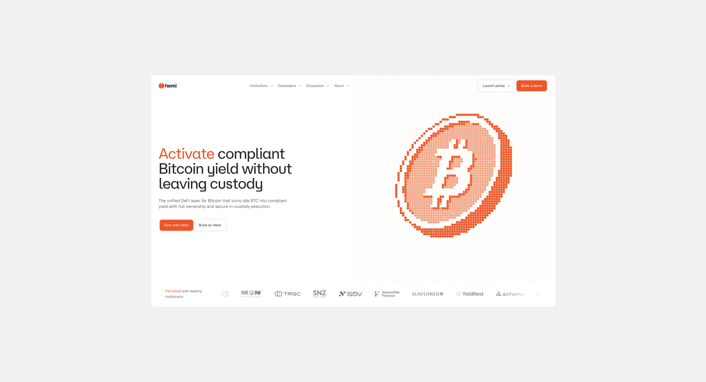
The platform had something Spotify cannot offer. Discovery made it invisible.
Methodology
Music first, crypto second. 13 page types. 7 content areas.
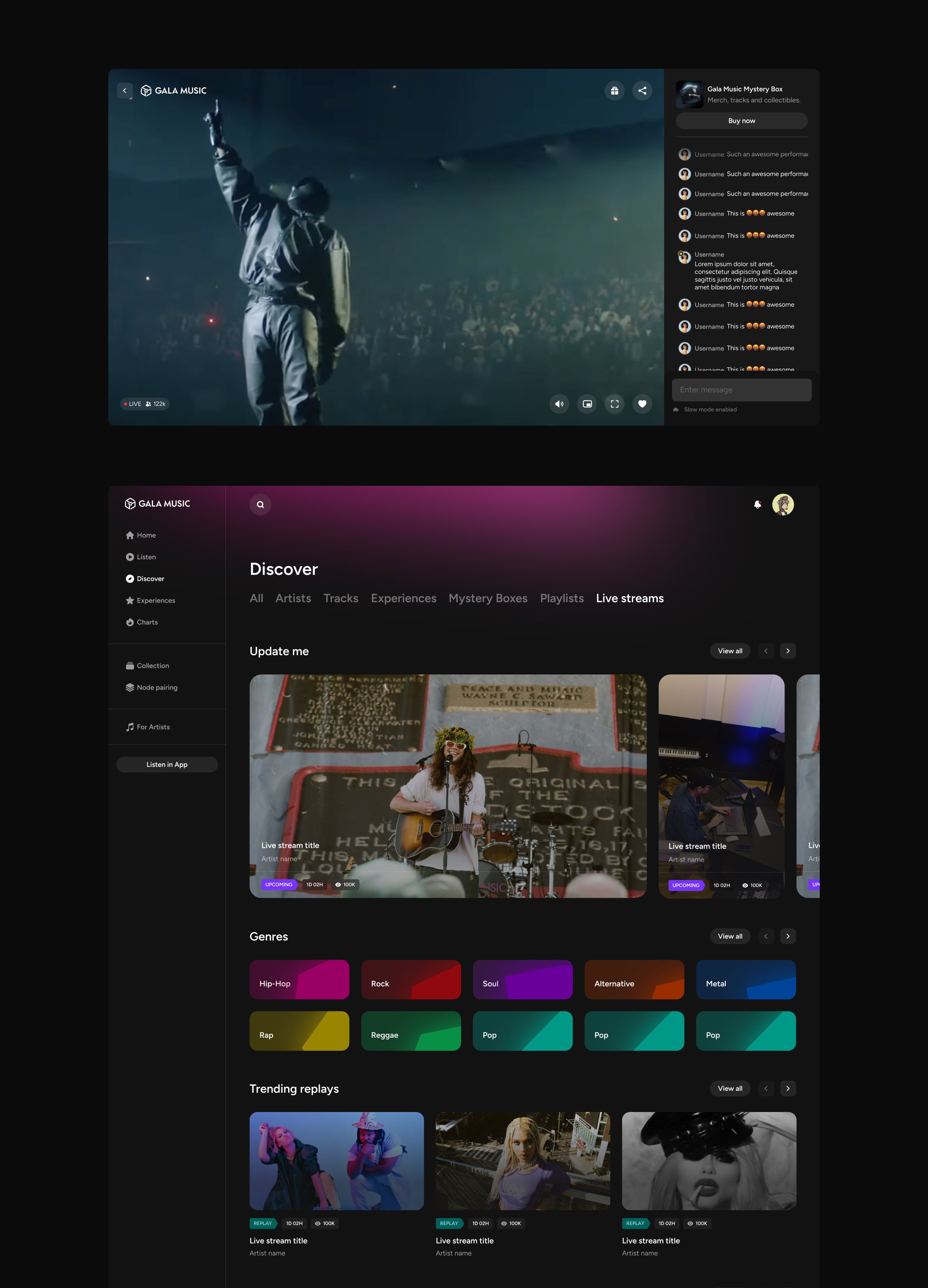
Full Discovery redesign across 7 content types: main Discover feed, Artists, Tracks, Experiences, Mystery Boxes, Playlists, and Live Streams. Each with its own index page, detail page, and editorial sections — all applying Web2 music discovery patterns to a Web3 content model.
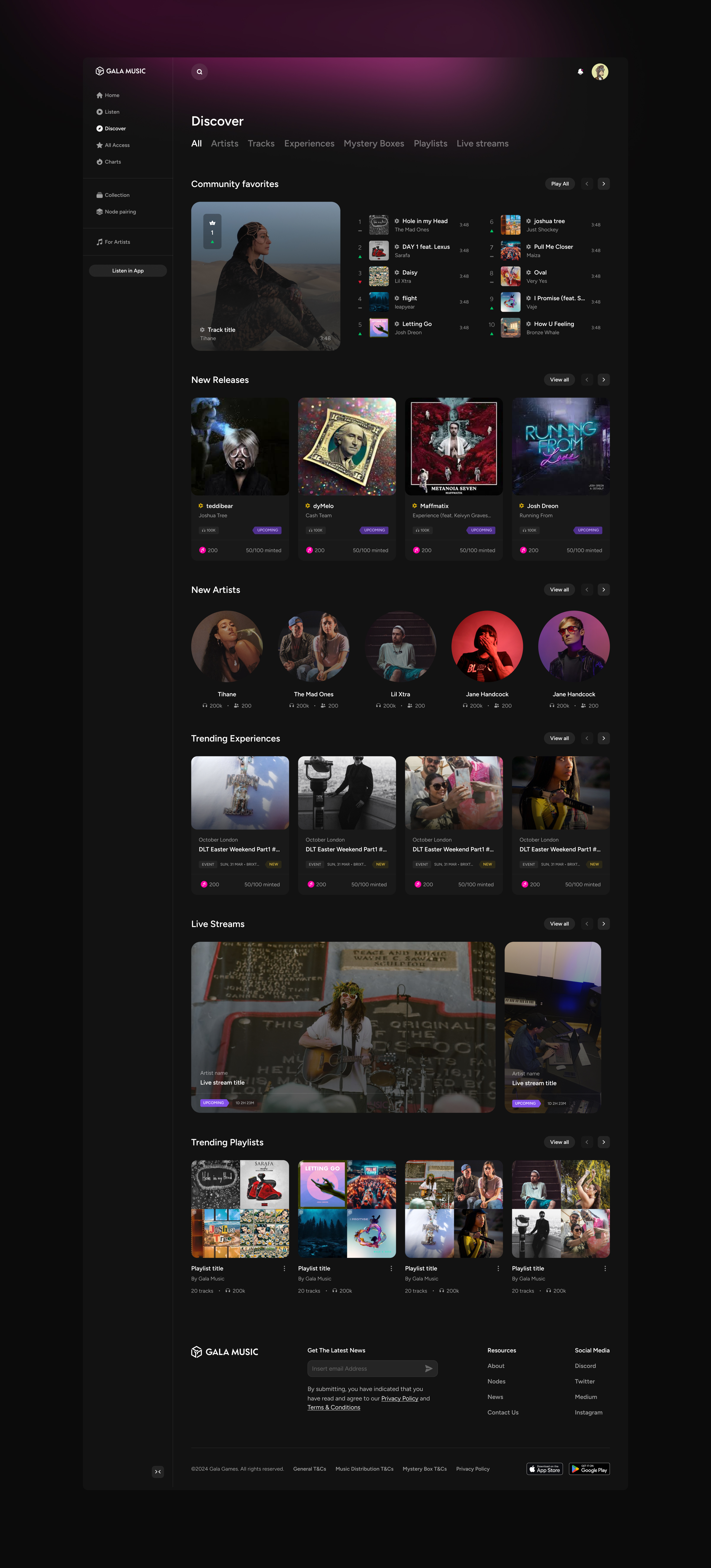
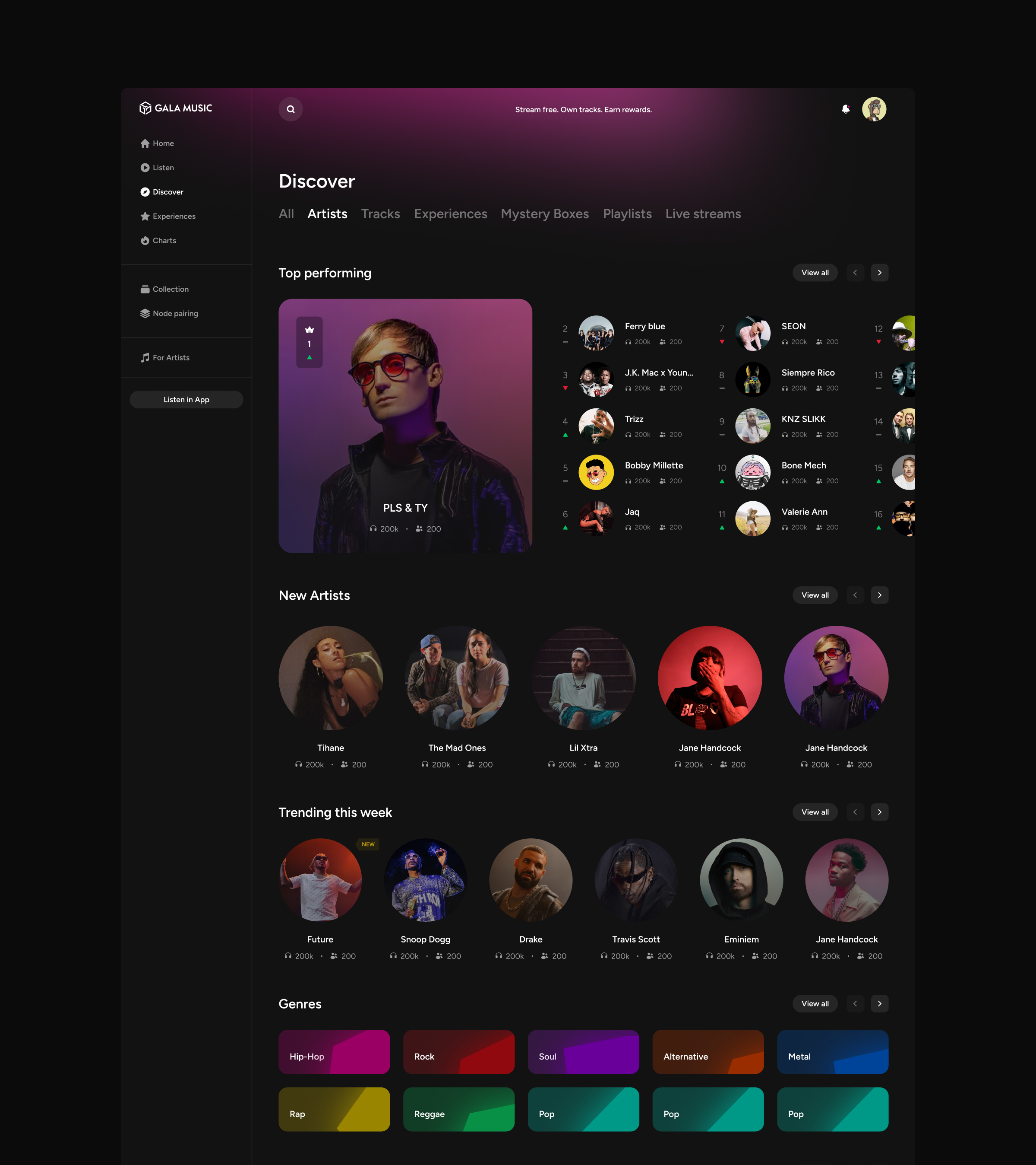
Discover: All
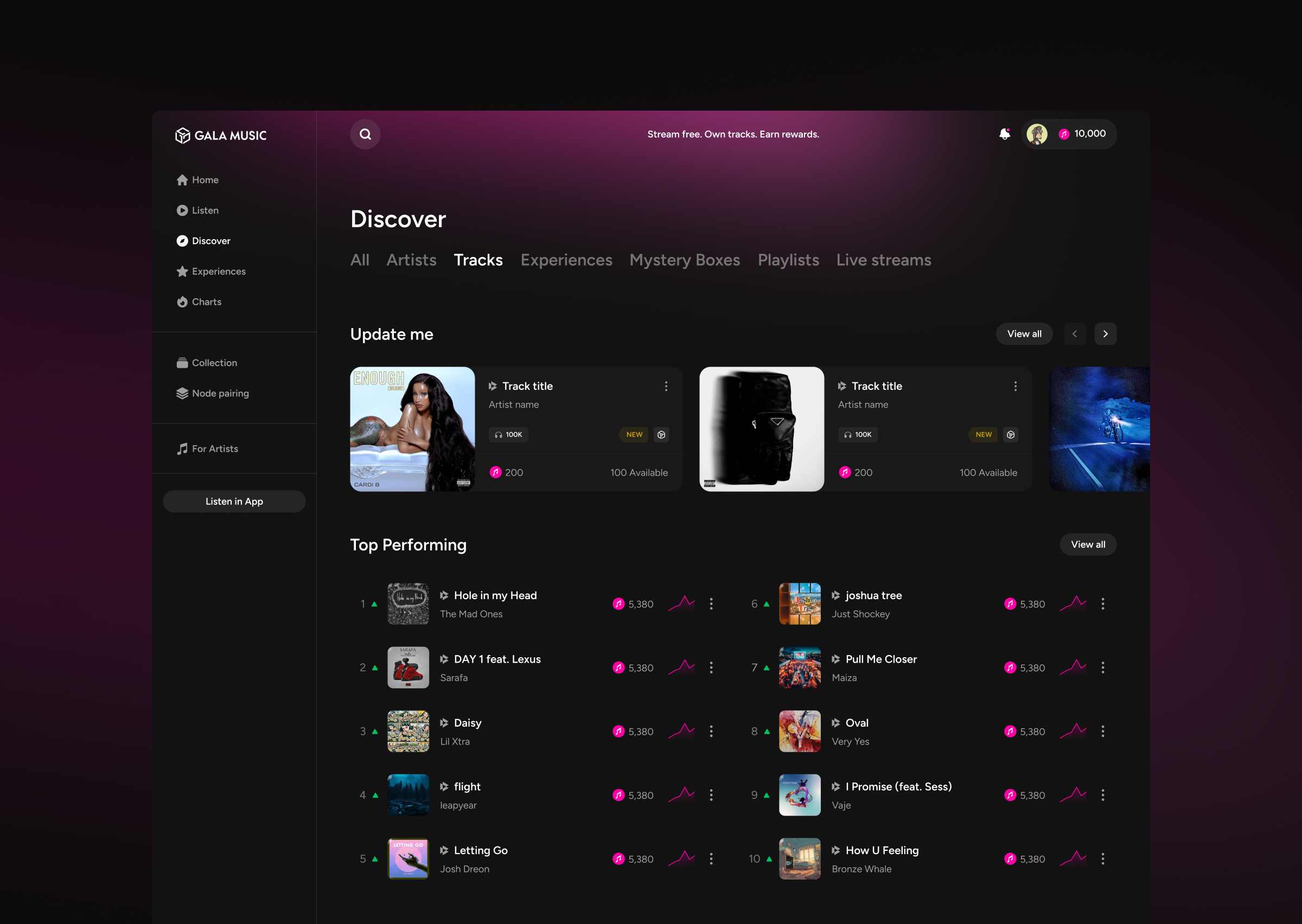
Tracks: Discovery
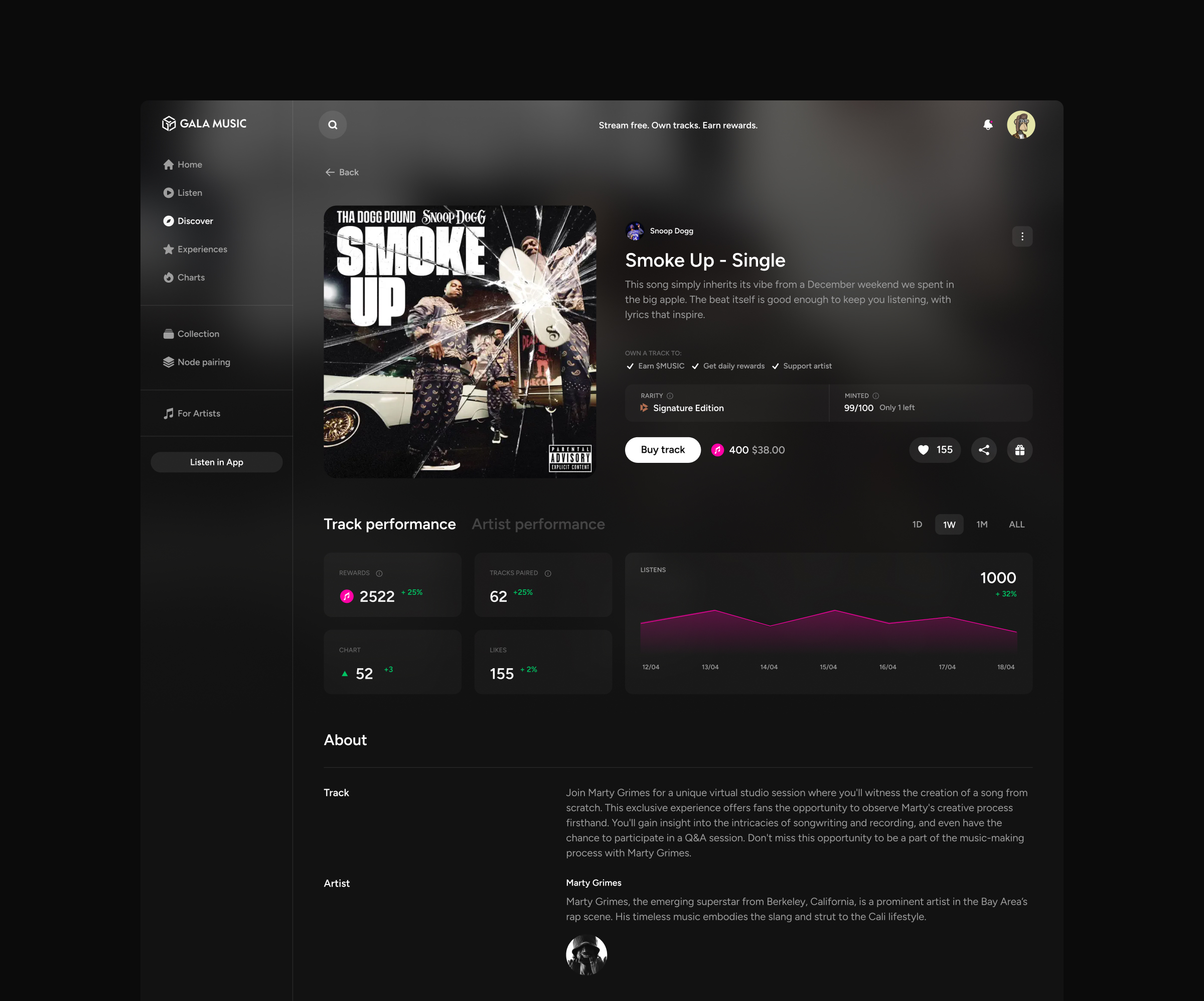
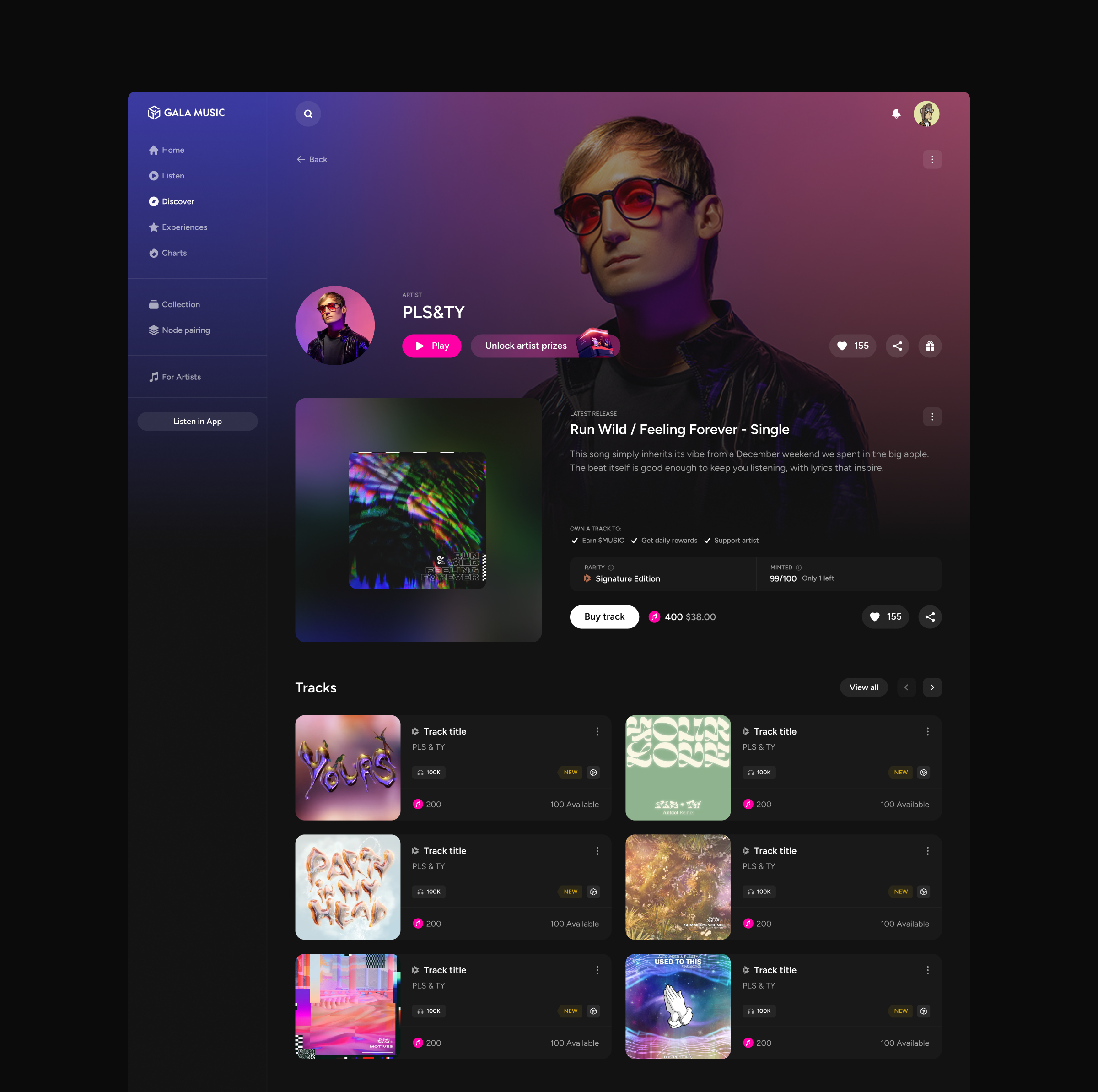
Track: Detail
Artists: Discovery
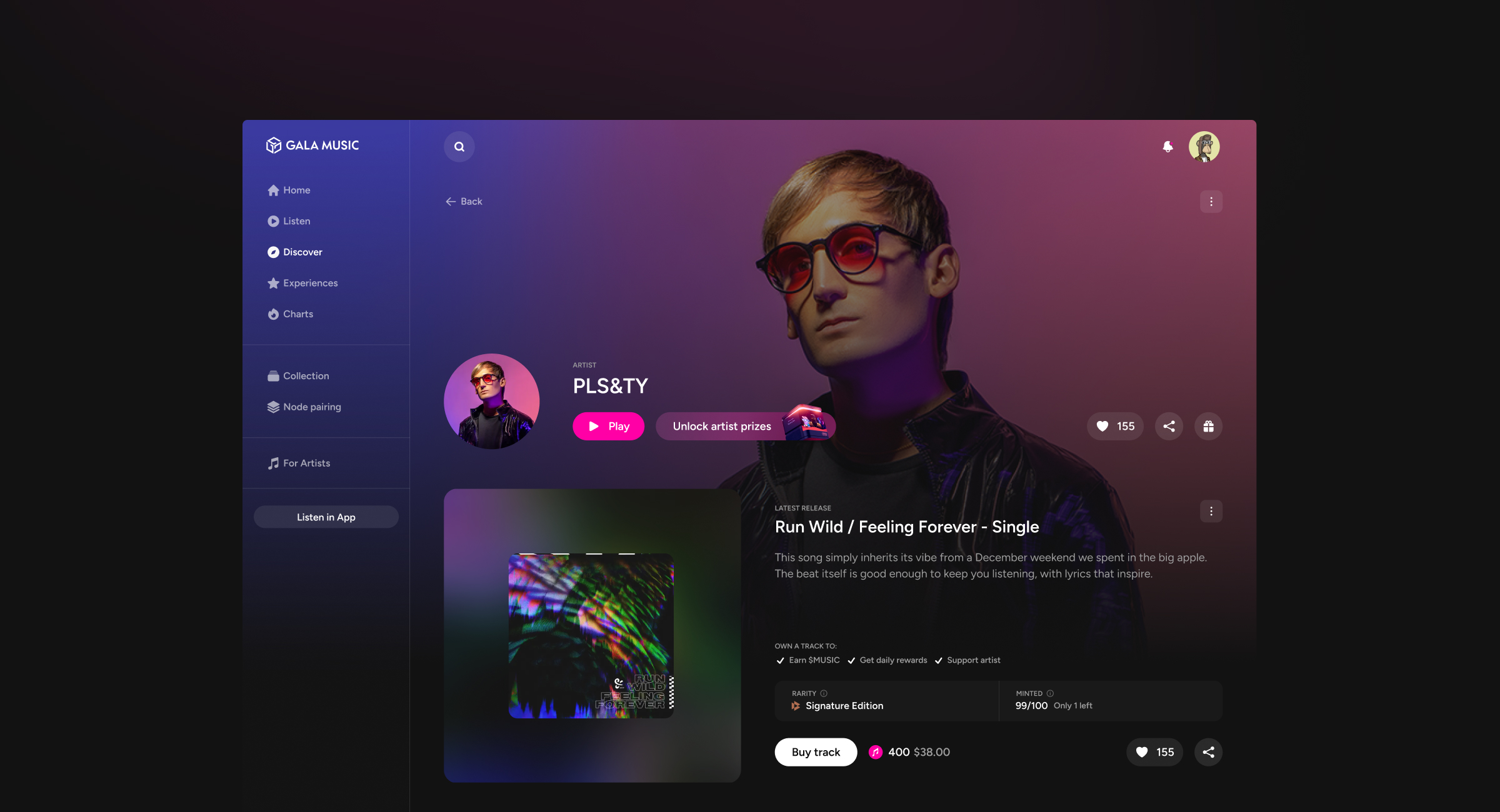
Artist: Detail Page
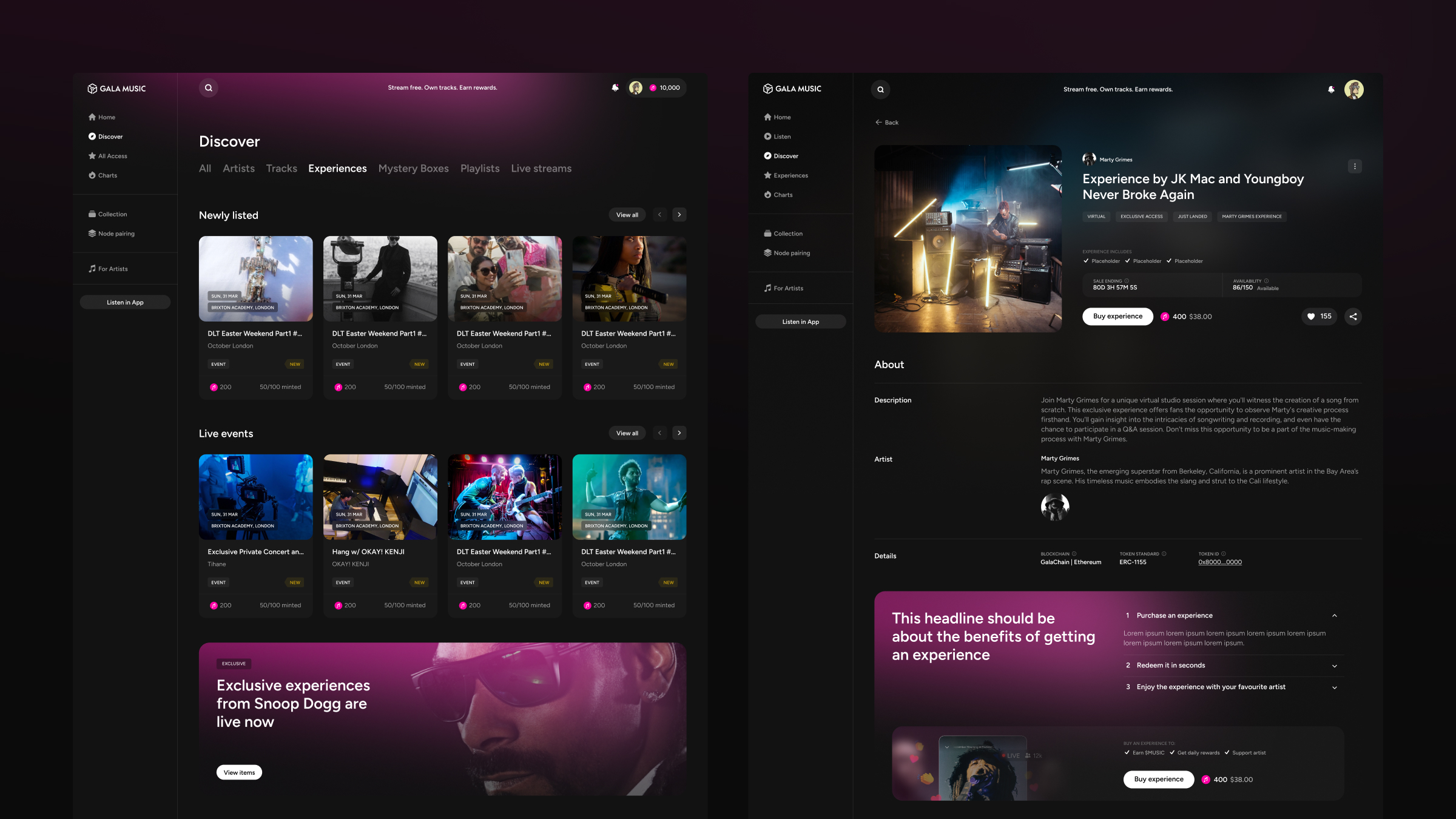
Experiences: Discovery and Detail
Playlists
13 page types. One principle: music first.
The brief was UI. The output was a full Discovery redesign: 13 page types, UX and UI, design system extended across all of them. The team was surprised by the speed of delivery. Working process and communication rhythm with Enrico (UX lead) and Charlie (art director) enabled unusually fast execution without sacrificing quality. The scope also grew beyond the original brief: a structured design-to-dev workflow was proposed and eventually adopted.

Strategic note
Your website has problems you can't see. I'll find them for you.
Free 30-minute call. No commitment. I'll share 2–3 observations about your site before we discuss anything else.
Your website has problems you can't see. I'll find them for you.
Free 30-minute call. No commitment. I'll share 2–3 observations about your site before we discuss anything else.
Your website has problems you can't see. I'll find them for you.
Free 30-minute call. No commitment. I'll share 2–3 observations about your site before we discuss anything else.