Four surfaces. One UX thread. 100,000 node operators in four weeks.

Decentralized data infrastructure. Four product surfaces. One UX thread.
Node sales break in four places. Every time.
Methodology
From brief to running node.
End-to-end UX across four product surfaces: marketing website, testnet onboarding, node sale checkout, admin panel, and desktop software. All shipped within a single coordinated release cycle.
Marketing Website

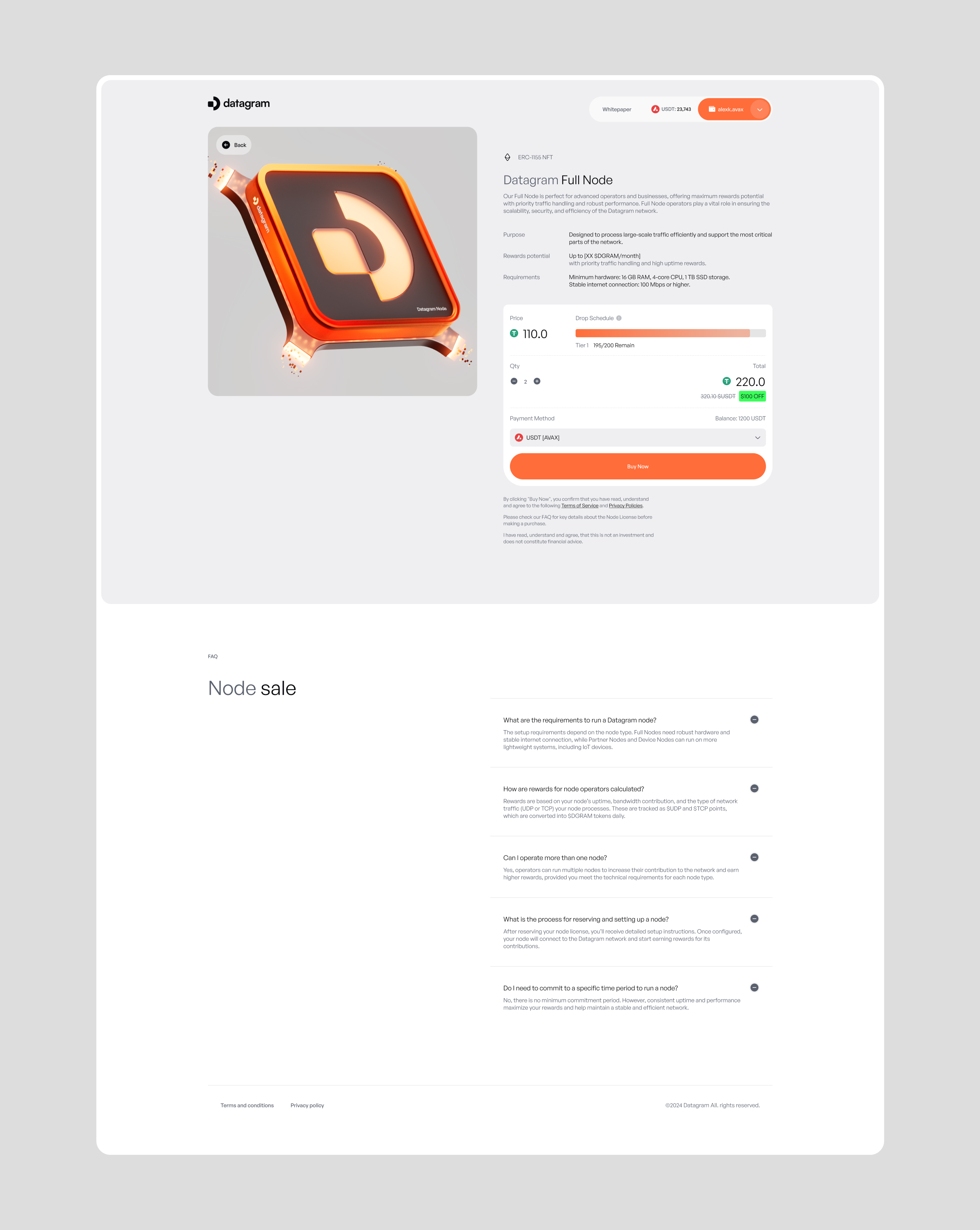
Node Sale Checkout
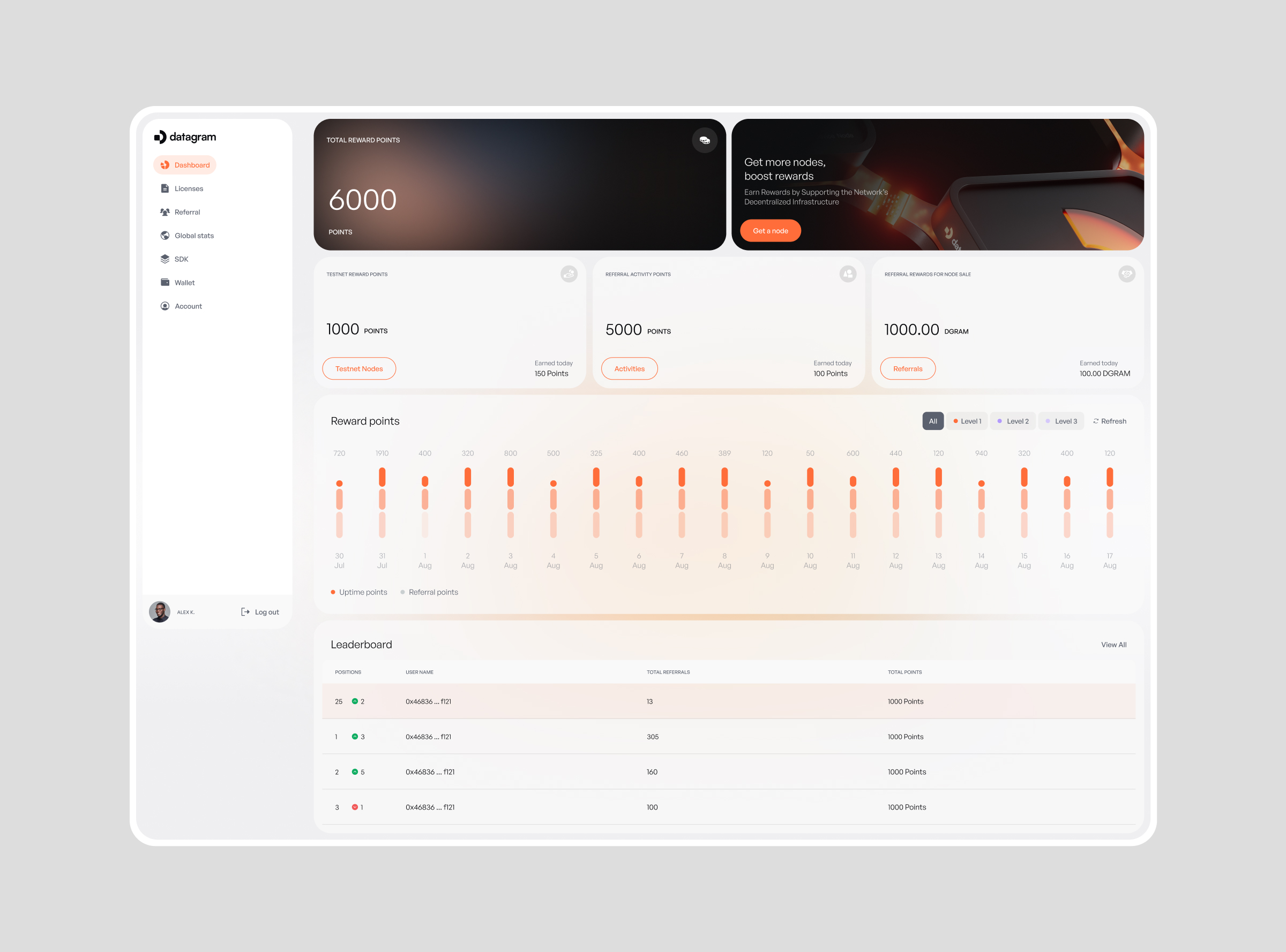
Admin Panel
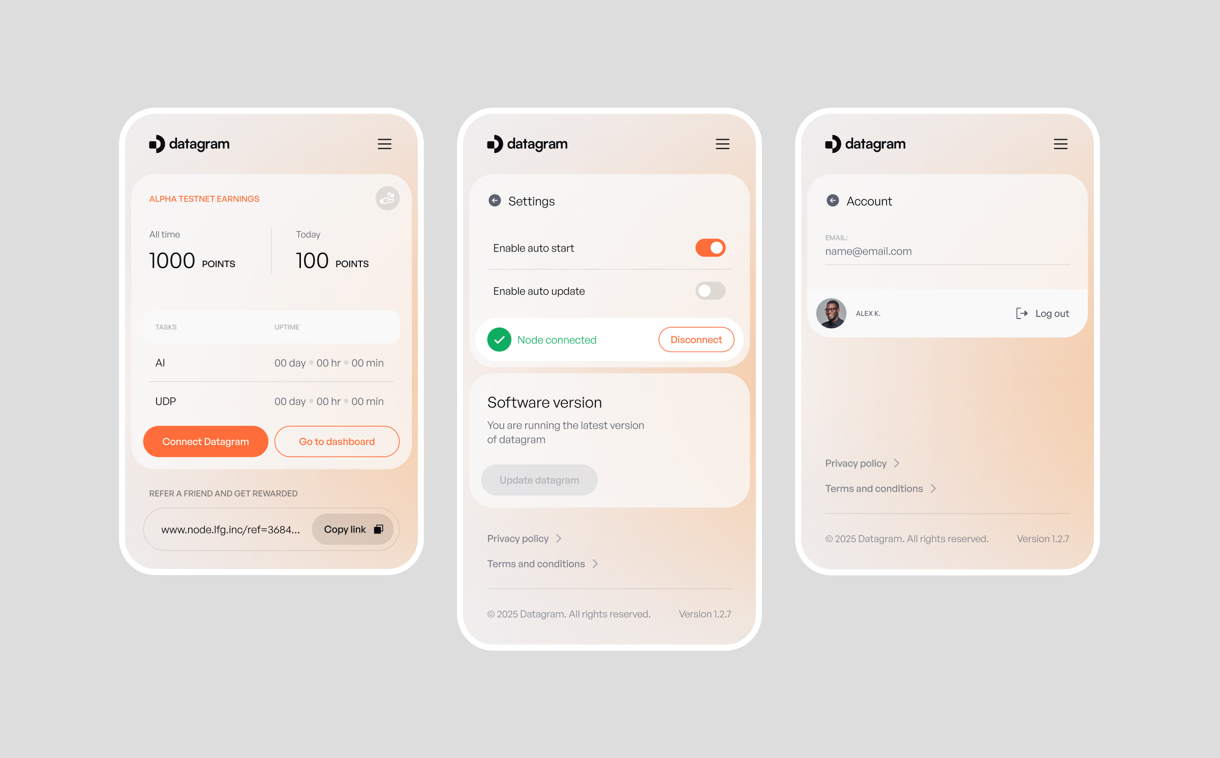
Desktop Node Software
100,000 node operators in four weeks.
The node sale was the funnel. The running node was the product. Most node sale UX treats the checkout as the endpoint. Get the user to pay. Done. That's wrong. The checkout is the beginning of the operational relationship. Every operator who doesn't successfully connect their node is a support ticket, a refund risk, and a negative signal in the community. The testnet launched and filled fast. 10,000 signups in the first 24 hours. The architecture worked as designed: every surface handed off to the next, no dead ends. Four product surfaces, one UX thread, zero broken handoffs.
Strategic note


Your website has problems you can't see. I'll find them for you.
Free 30-minute call. No commitment. I'll share 2–3 observations about your site before we discuss anything else.
Your website has problems you can't see. I'll find them for you.
Free 30-minute call. No commitment. I'll share 2–3 observations about your site before we discuss anything else.
Your website has problems you can't see. I'll find them for you.
Free 30-minute call. No commitment. I'll share 2–3 observations about your site before we discuss anything else.