The client asked for 10 new sections. The site needed a complete rebuild.
A Framer expansion brief that became a production Rails site, custom CMS, CRM, and deployment pipeline.
Adding 10 sections to a broken foundation wouldn't fix anything.
Old binsrinspect.com: hidden navigation, waitlist CTA, and 22+ viewport scroll
Seven workstreams. Eight weeks. One governing principle: audit before designing.
What the client got.
Seven live systems built from a brief for 10 Framer sections. Every screen audit-driven. Every field purpose-built. No templates, no vendor lock-in.
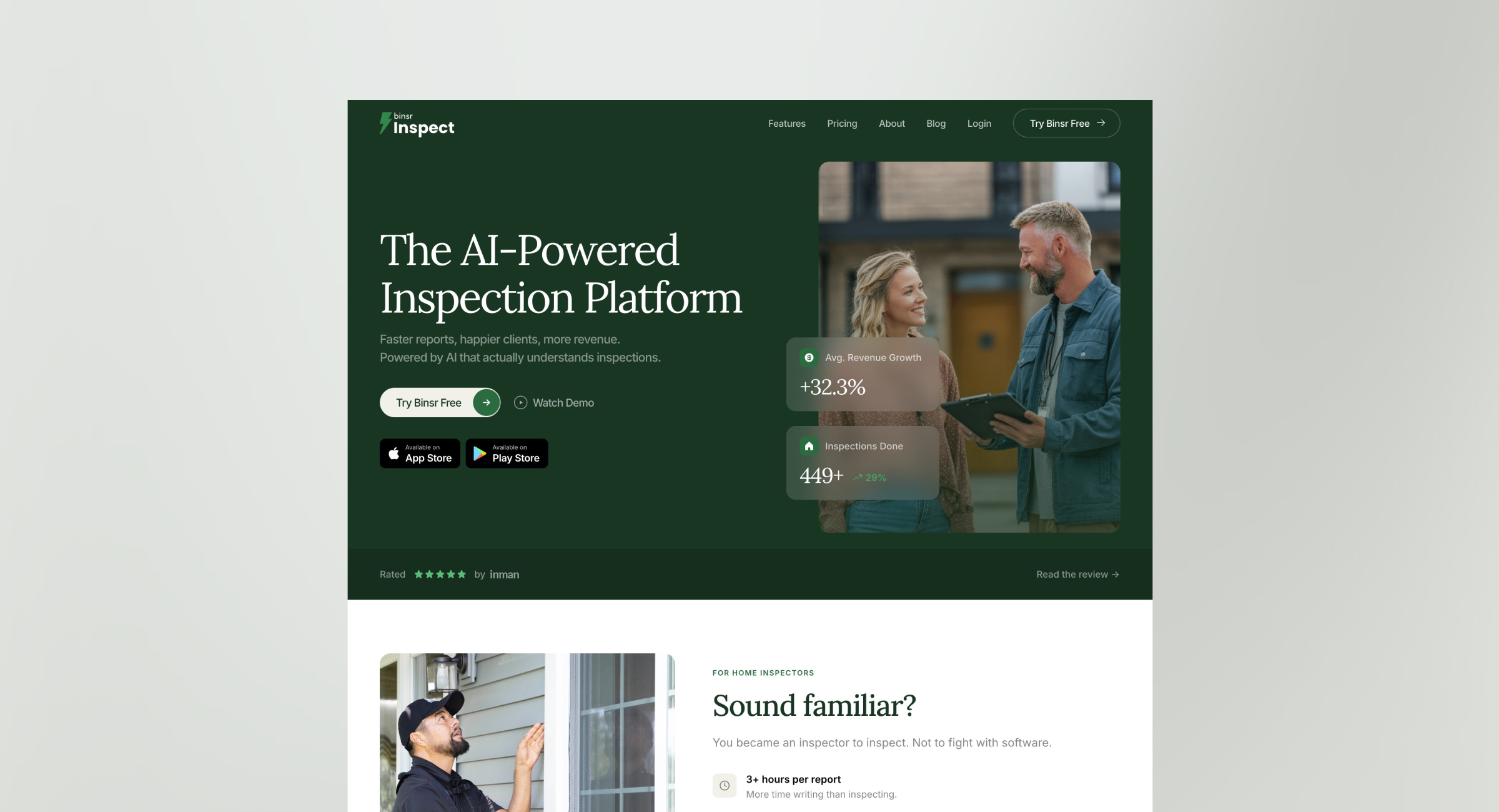
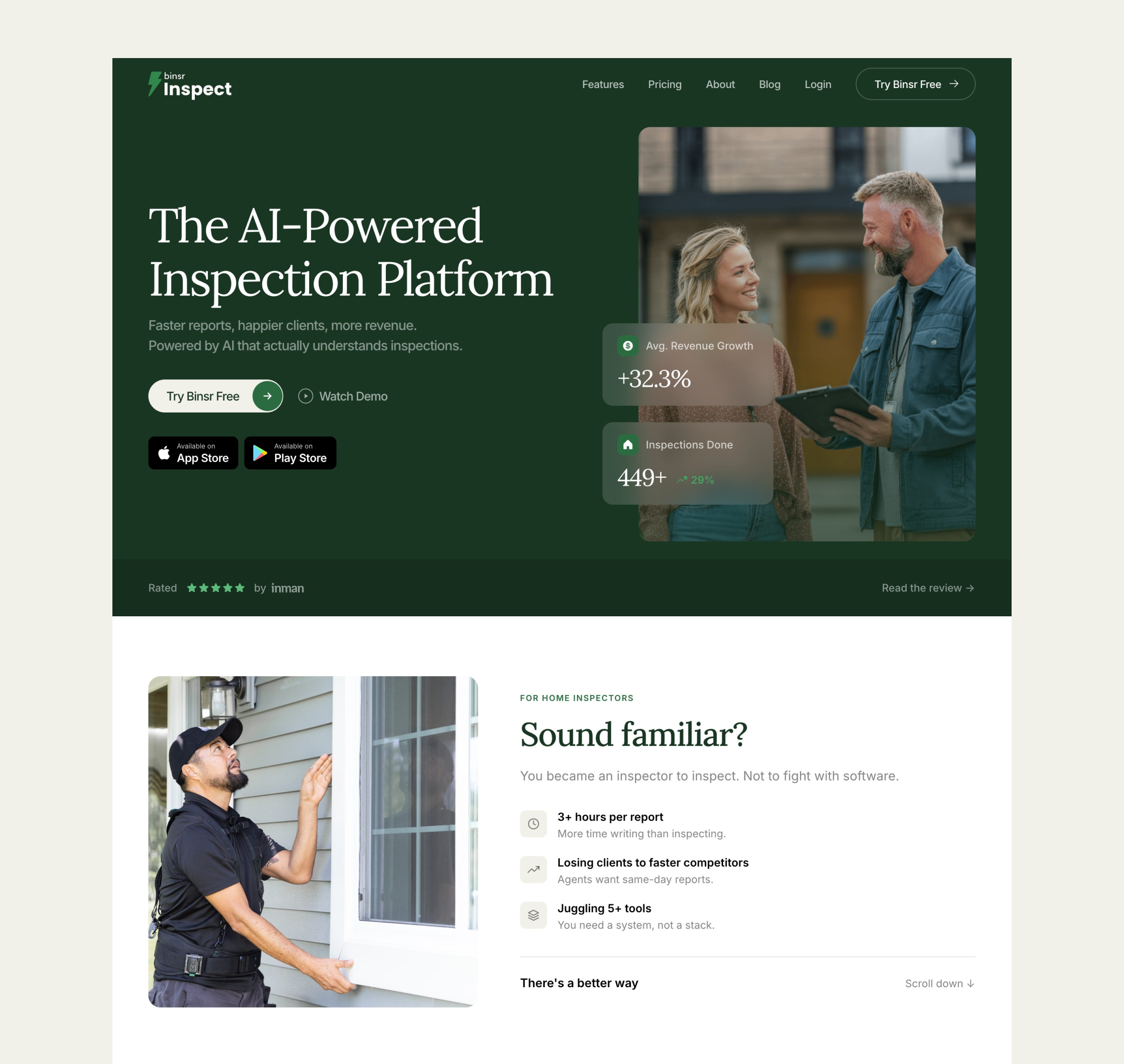
Homepage
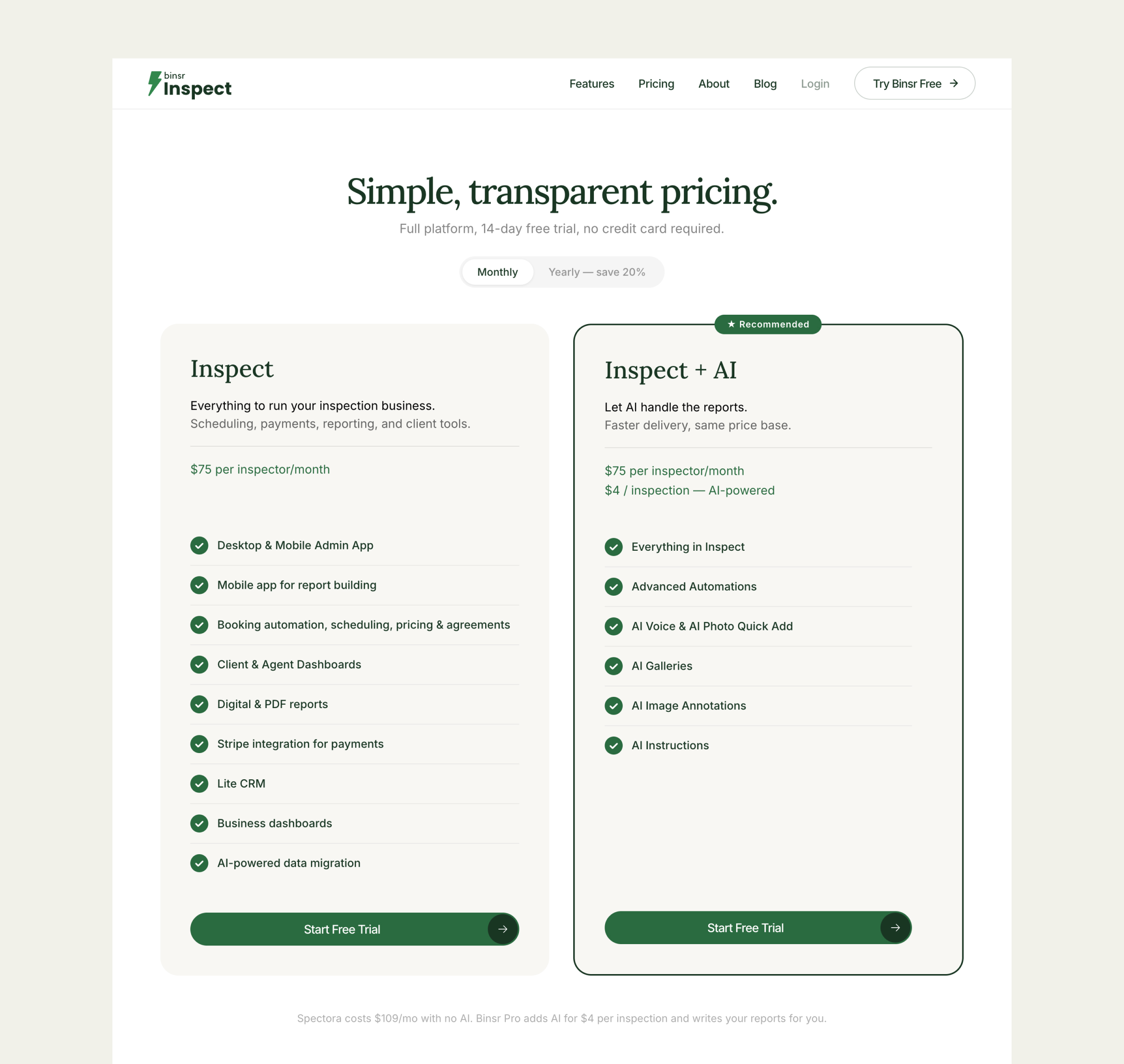
Pricing
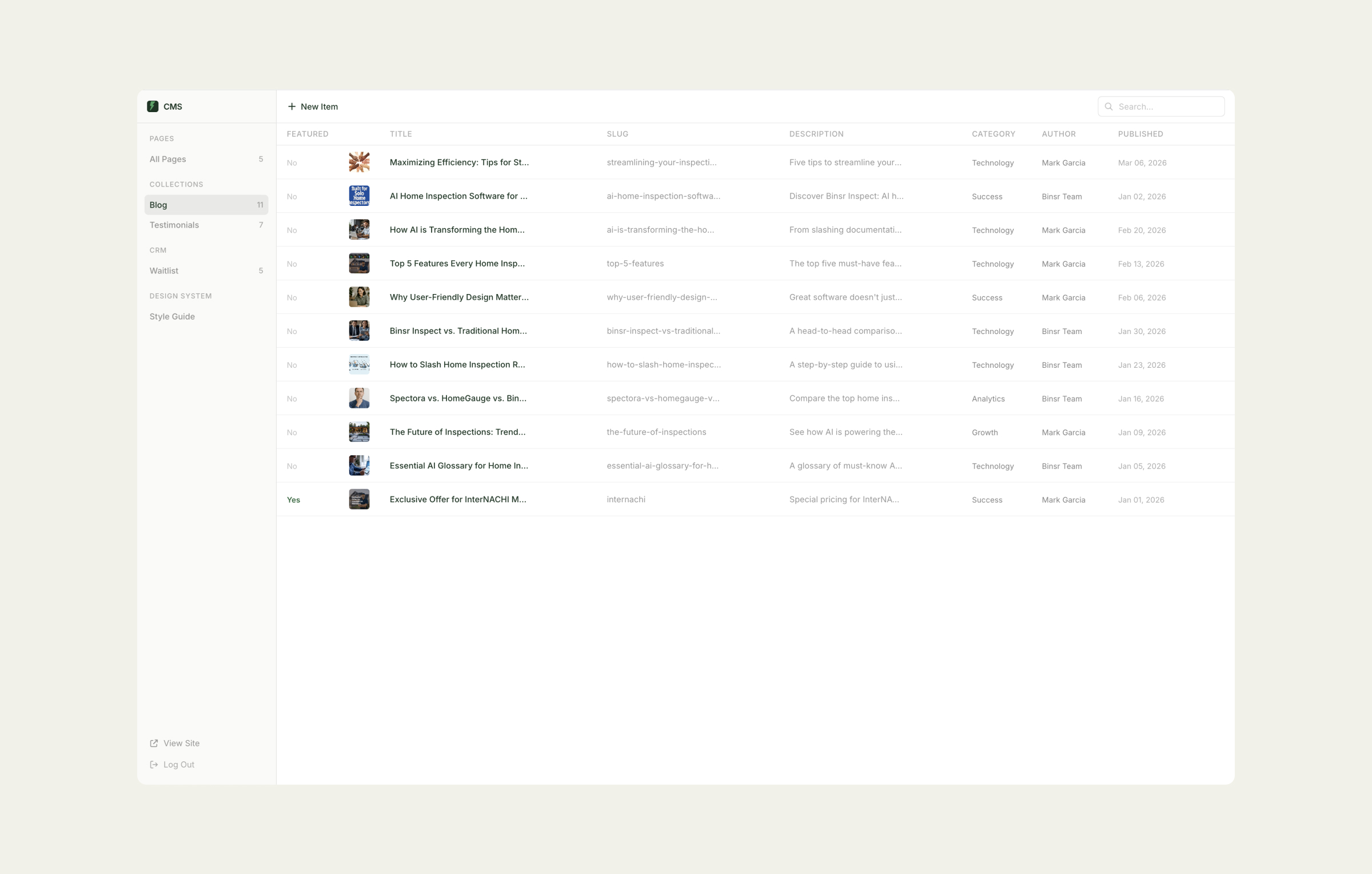
CMS Collections
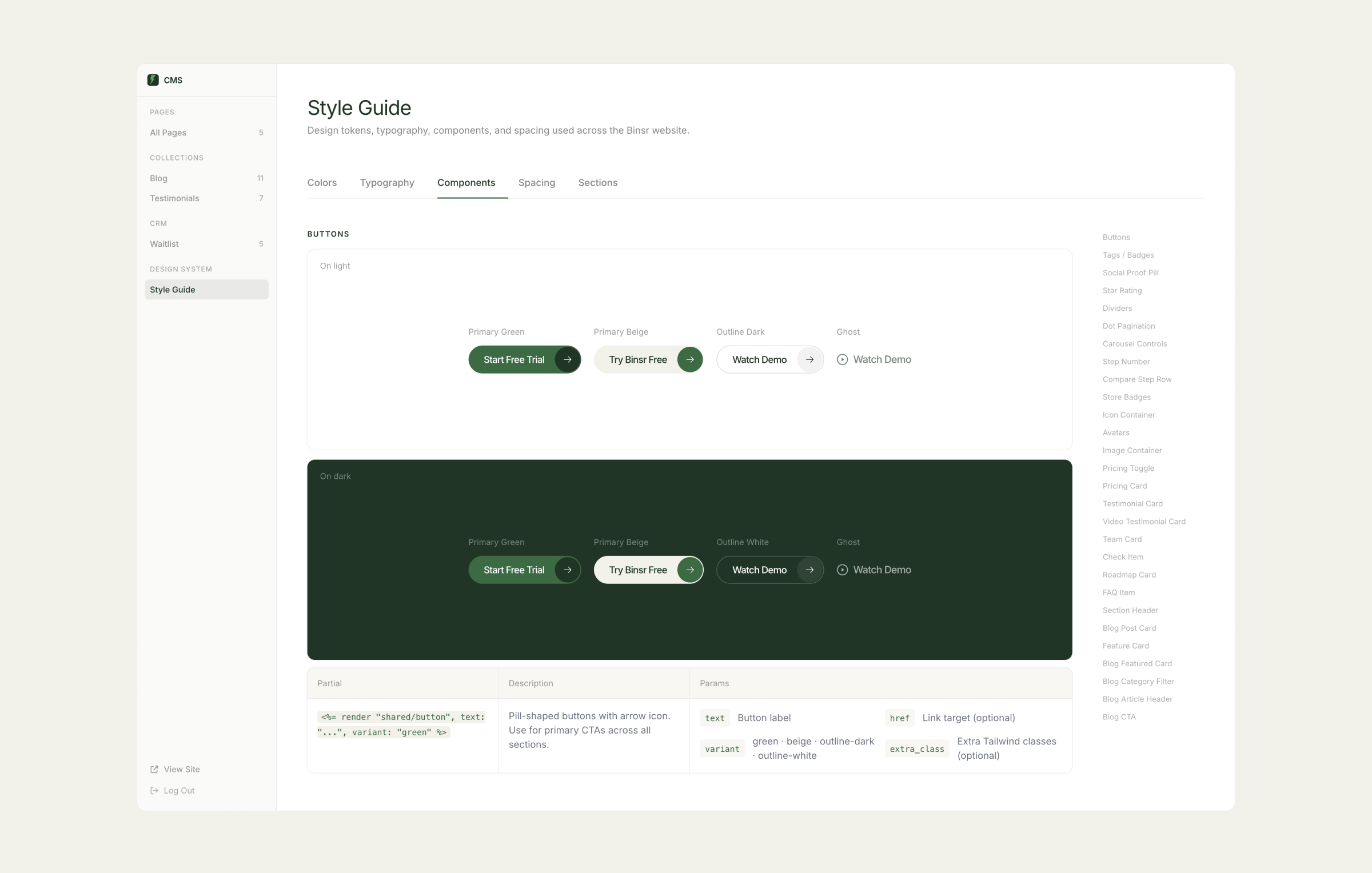
Design System: Components
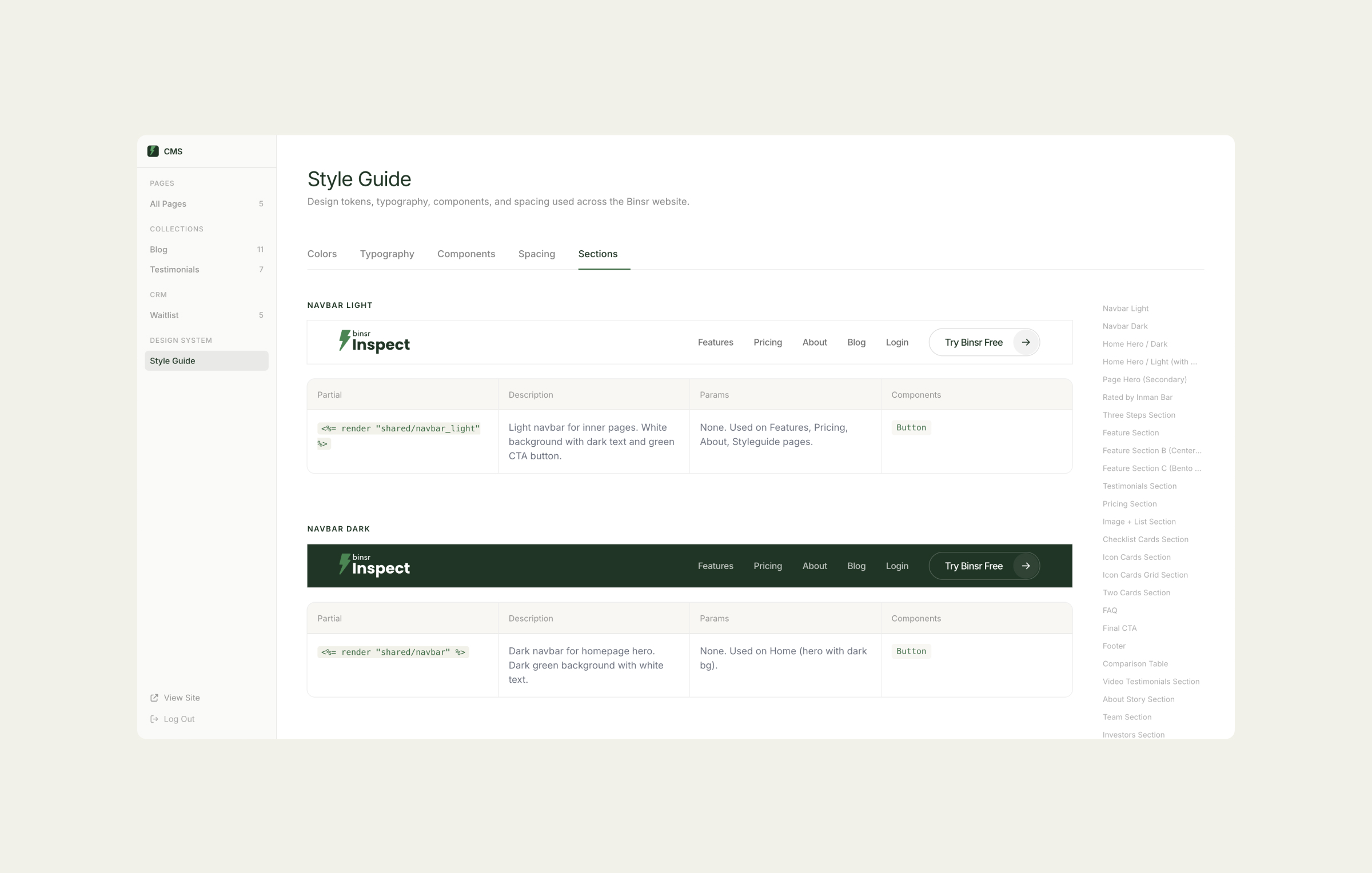
Design System: Sections
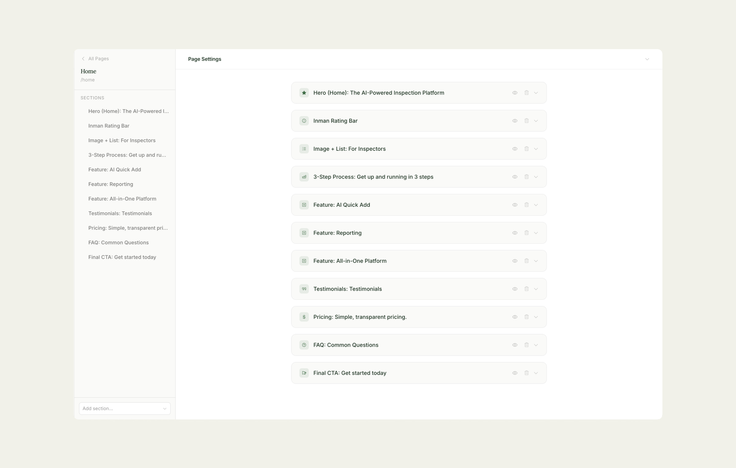
CMS Page Editor
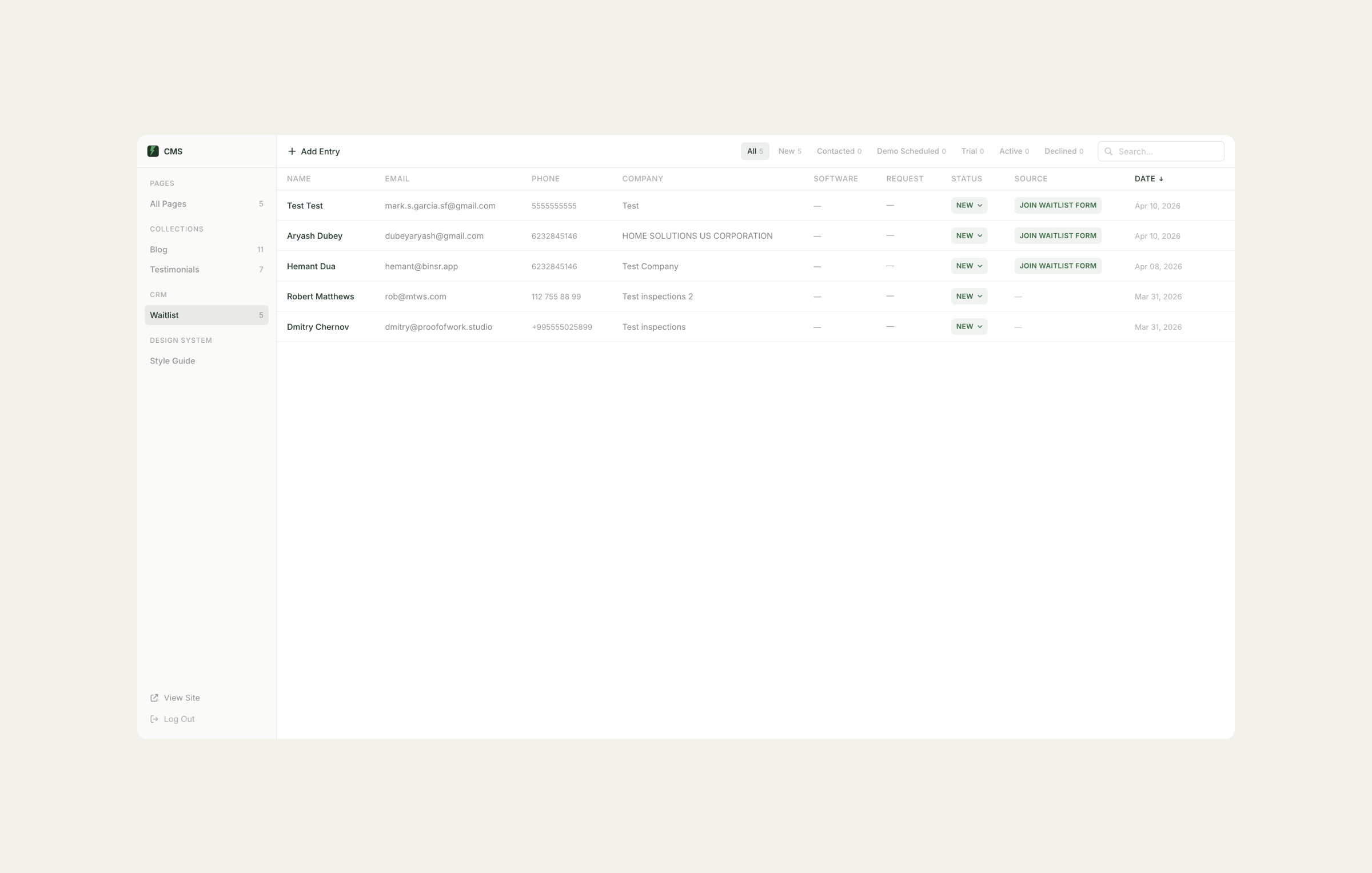
CRM: Lead Management
The same product. Rebuilt for conversion.
51 documented issues on the old site. 14 remaining on the new one. The comparison below maps the specific changes that addressed each dimension of the audit: structure, narrative, conversion signals, and platform.
3-5× value delivered. All critical issues gone. 0 issues remaining.
51 issues on the old site. 14 remaining on the new one. 0 critical. The narrative arc was corrected. Navigation visible. CTAs lead to a free trial. Pricing simplified. And the platform itself shifted from Framer to a fully owned Rails codebase with custom CMS, CRM, blog, design system, and deployment pipeline.
Strategic note

Your website has problems you can't see. I'll find them for you.
Free 30-minute call. No commitment. I'll share 2–3 observations about your site before we discuss anything else.
Your website has problems you can't see. I'll find them for you.
Free 30-minute call. No commitment. I'll share 2–3 observations about your site before we discuss anything else.
Your website has problems you can't see. I'll find them for you.
Free 30-minute call. No commitment. I'll share 2–3 observations about your site before we discuss anything else.