Website Audit

Find what's broken in your website. Before you redesign anything.

A structured audit across 4 pillars: brand, UX, UI, and conversion. 40–70+ findings, each with severity and a specific fix. Delivered in 2 business days.

Audit by 4 pillars
Brand
Positioning, messaging, and narrative clarity
8 criterias
UX
Architecture, navigation, and user flows
6 criterias
UI
Visual design, typography, and responsiveness
8 criterias
Conversion
CTAs, trust signals, and conversion flow
6 criterias
Book a free 30-minute call:
I'll share 2–3 observations about your site.

Your website has problems.
You just can't see them yet.

Most aren't obvious. They're patterns: 40 to 70 small things across messaging, UX, UI, and conversion that add up to a site that loses clients you never see.

Example: Aave website
Audit report: Aave
Website Design Audit Report
aave.com 22 39
Breakdown by pillar
✓ 22 strengths ✗ 39 issues
Brand
6 / 9
UX
5 / 12
UI
7 / 10
Conversion
4 / 8
Overview
First impression 
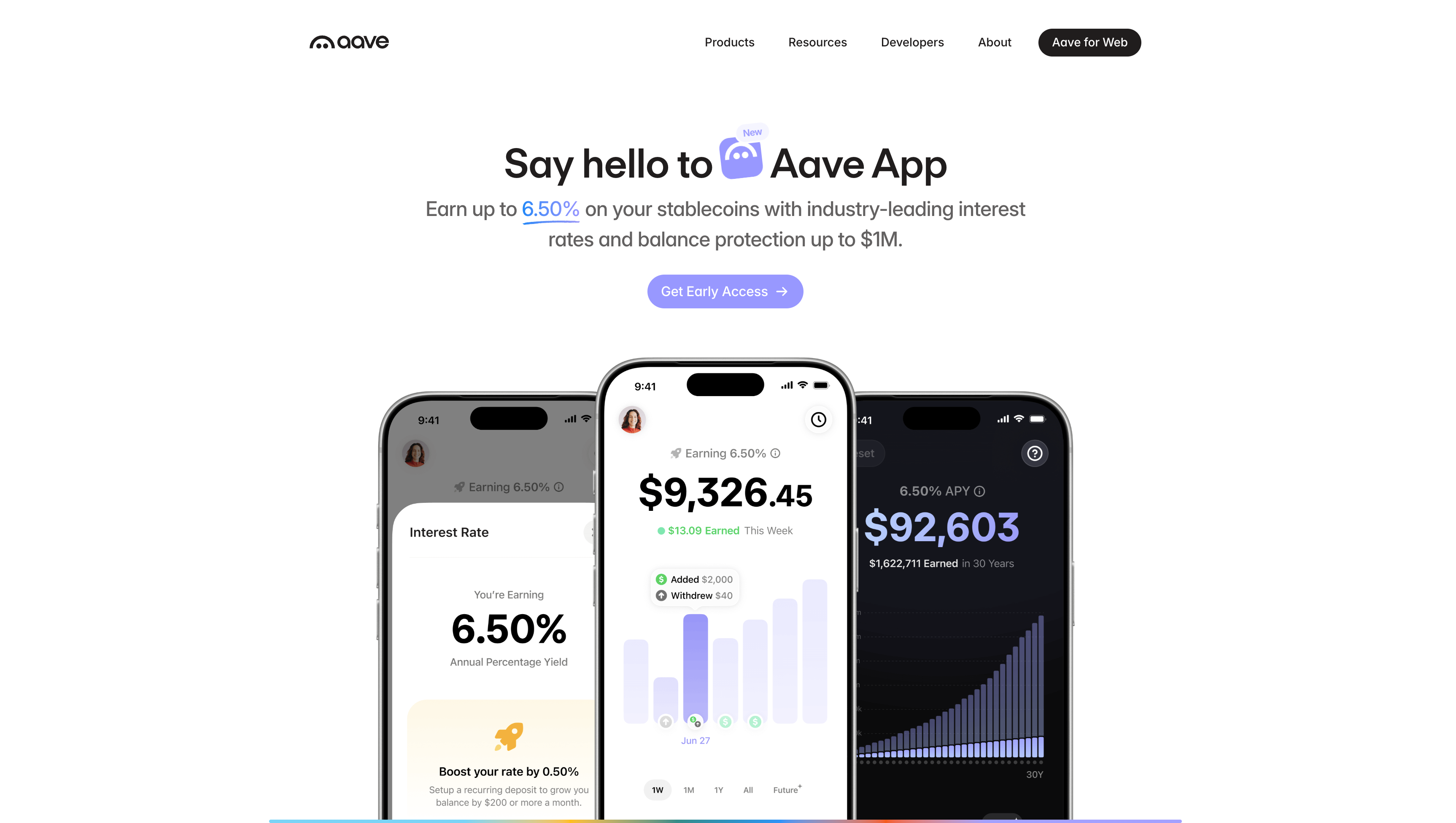
Strong protocol credibility undermined by fragmented positioning. Homepage tries to serve three products simultaneously, diluting the message for all audiences.
Key pattern Navigation is clean but hides strategic products. Aave Horizon — a $500T institutional opportunity — has zero presence. Newcomers hit wallet-connection walls before seeing any value.
By the numbers 39 issues across four pillars, with the most critical gaps in UX (12 issues) and Conversion (8 issues). Brand has strong visual foundations, and the UI quality is generally high.
Critical findings
!
Identity crisis between three products Homepage simultaneously promotes Aave App, Aave for Web, and Aave for builders. Hero defaults to consumer savings, potentially alienating 70% of crypto-native users.
FixCreate distinct landing experiences per segment with audience-based navigation: "For Savers" (Aave App), "For DeFi" (Aave for Web), "For Builders", "For Institutions".
!
Institutional segment invisible Despite being a strategic pillar for 2026 with $500T addressable market, Aave Horizon has zero presence in navigation or homepage.
FixAdd Aave Horizon to the Products navigation dropdown and create a dedicated /horizon page addressing compliance, permissioned access, and RWA capabilities.
!
Trust signals buried $55B TVL, 61.5% market share, $885M revenue, 5+ years without losses. Yet the homepage buries most behind dynamic counters showing "$0B".
FixFront-load trust signals with exact figures above the fold. Replace dynamic counters with static fallback values to prevent broken social proof.
Key strengths
Strong developer experience /build page with case studies, SDKs, direct contact form — best-in-class B2B path for DeFi.
Polished visual consistency Dark-theme UI is cohesive, modern, and data-rich. Power users find everything they need.
Savings simulator on /app Interactive calculator with bank comparison. Strongest consumer-facing page in all of DeFi.
Comprehensive security section Dedicated section with bug bounty, auditor logos, emergency shutdown controls.
Top recommendations
Create distinct landing experiences Implement audience-based navigation: "For Savers", "For DeFi", "For Builders", "For Institutions". Each segment needs its own hero and CTA hierarchy.
Add Aave Horizon to the site Create a dedicated /horizon page and add it to Products navigation. Critical gap for 2026 institutional strategy.
Front-load trust signals Replace generic language with exact figures: "$55B in deposits", "61.5% market share", "5 years, zero user fund losses".
Fix dynamic counter fallbacks "Why choose Aave?" metrics render as "$0B" — add static fallback values to prevent broken social proof.
Segment the homepage hero Consider audience selector or rotating hero sections instead of defaulting to Aave App for all visitors.
Detailed analysis
Brand & Narrative
✓ 6 ✗ 9
Positioning Clarity 6/10
Homepage tries to serve three products simultaneously, diluting positioning.
Three products compete for hero position without clear hierarchy
FixEstablish a clear homepage hierarchy with a unifying ecosystem statement, then provide distinct entry points per audience.
No overarching positioning statement unifying the ecosystem
FixCreate a positioning framework: 'Aave is the infrastructure layer for onchain finance' — then branch into consumer, DeFi, Builder, Institutional.
Individual product pages (/app, /build) have strong positioning
Target Audience 5/10
Site acknowledges DeFi users and developers well, but mainstream consumers and institutional investors lack dedicated pathways.
Institutional investors (Aave Horizon) have zero dedicated content
FixAdd an 'Institutions' or 'Horizon' section to the Products navigation and create a dedicated landing page.
No audience segmentation on the homepage
FixCreate distinct content pathways for crypto-native users vs. newcomers on the homepage.
Strong developer path: /build with SDKs and case studies
Good newcomer path: /app with savings simulator
Message Hierarchy 6/10
Clear primary message (Aave App) but supporting messages compete rather than reinforce.
Dynamic counters show '$0B' — likely loading issue breaks social proof
FixAdd static fallback values to the 'Why choose Aave?' metrics so they never render as $0B.
Abrupt topic shift from consumer savings to B2B pitch mid-page
FixRestructure homepage flow: Ecosystem Overview → Audience Paths → Social Proof → Security → CTA.
Partner logos and security section are well-placed
Competitive Differentiation 7/10
Strong implicit differentiation through scale ($55B TVL, 61.5% market share) but no explicit comparison.
No 'why us' comparison page or section
FixAdd a 'Why Aave' section with specific numbers: $55B deposits, 61.5% market share, 5 years zero losses.
Scale metrics are genuinely best-in-class and defensible
5+ years without user fund losses — unique in DeFi
UX Audit
✓ 5 ✗ 12
Navigation & IA 6/10
Clean top-level nav but Products dropdown hides key pages. No search.
Aave Horizon missing from navigation entirely
FixAdd Horizon to the Products dropdown immediately — this is a quick win with high strategic impact.
No global search — critical for documentation-heavy site
FixImplement site-wide search with Algolia or similar, covering docs, blog, and product pages.
Products dropdown organizes sub-brands logically
User Flows 5/10
Crypto-native users find their way, but newcomers hit dead ends.
Wallet connection required before seeing any product value
FixAdd a demo mode or interactive preview that shows the app interface before requiring wallet connection.
No demo or preview mode for undecided visitors
FixCreate an interactive savings calculator on the homepage that demonstrates value without signup.
Savings simulator on /app is excellent progressive disclosure
Mobile Experience 7/10
Responsive and functional but some data-heavy sections are cramped on small screens.
Statistics section overflows on narrow viewports
FixAdd horizontal scroll or stack metrics vertically on mobile viewports below 480px.
Navigation collapses cleanly to hamburger menu
Touch targets are appropriately sized
UI Audit
✓ 7 ✗ 10
Visual Design 8/10
Polished dark-theme with strong brand consistency.
Cohesive dark theme with consistent component library
Strong use of data visualization in app interface
Some pages mix dark and light themes inconsistently
FixEstablish a clear rule: marketing pages use light theme, app/dashboard uses dark theme. No mixing.
Typography & Hierarchy 7/10
Clean type scale on most pages, but homepage mixes too many sizes.
Consistent heading hierarchy on product pages
Homepage has 6+ font sizes competing for attention
FixReduce to 3-4 font sizes on the homepage: hero, section heading, body, caption.
Some body text lacks sufficient contrast on dark backgrounds
FixIncrease body text opacity from 60% to 80% on dark backgrounds for WCAG AA compliance.
Component Consistency 8/10
Well-built design system with reusable components across pages.
Buttons, cards, and badges are consistent across sections
Form elements follow a unified pattern
CTA button styles vary between /app and main site
FixUnify CTA button styles: same border-radius, padding, and color system across all pages.
Conversion Audit
✓ 4 ✗ 8
CTA Strategy 5/10
Multiple competing CTAs with no clear primary action.
Two primary CTAs compete in the hero section
FixChoose one primary CTA per page. Hero should have one clear action with a secondary option below.
No clear single action for first-time visitors
FixAdd a prominent 'Get Started' flow that adapts based on whether the visitor is a newcomer or crypto-native.
/app page has focused, effective CTA hierarchy
Trust & Social Proof 6/10
Impressive metrics buried or broken.
'Why choose Aave?' counters render as '$0B'
FixReplace dynamic counters with static values as fallback. Show '$55B+' instead of loading animation.
5-year safety record buried in small card
FixMove safety track record to a prominent position above the fold. This is Aave's strongest differentiator.
Security section with auditor logos builds confidence
Partner testimonials from MetaMask, Chainlink add credibility
Onboarding & Retention 7/10
Strong for existing users via the app. Weak for acquiring new users.
No email capture or newsletter for nurturing leads
FixAdd an email signup with a value prop like 'Weekly DeFi insights' to capture visitors who aren't ready to connect a wallet.
App onboarding with savings simulator is best-in-class
Developer documentation is comprehensive
Summary Aave has world-class protocol fundamentals and an impressive track record. The primary challenge is organizational: one website trying to serve four distinct audiences with competing narratives. The fix is structural — audience segmentation, not a redesign.
22 strengths
39 issues found
5 recommendations
This week's audit: Aave
Aave website

What's inside

40–70+ findings across 4 pillars. Every issue has a severity level, a location, and a specific fix.

Interactive Issue Checklist
Every finding as a trackable item. Filter by pillar, severity, or quick wins.
90-Day Action Plan
5–10 prioritized actions. What to do, who does it, and effort estimate.
ICP + Competitive Research
Target audience profile, 3 closest competitors analyzed, positioning gaps identified.
60-min Expert Walkthrough
Live review of findings. We prioritize what moves the needle given your budget, stage, and timeline.
Full Audit Report
40–70+ findings by pillar and severity. Each includes: what's wrong, why it matters, and exactly how to fix it.
40–70+ findings
Across Brand, UX, UI, and conversion.
2 business days
From kickoff to full report.
Expert + AI
Strategic judgment, AI-accelerated data.

The starting point.

40–60% of audit clients continue to a full redesign. You'll decide after you see what's actually broken.

Expert Audit
$1,500
2 business days
Standalone deliverable. You keep the findings regardless of what happens next.
01
Free 30-min call: what your product does, where growth is stuck
02
AI-powered audit: 40–70+ findings across brand, UX, UI, and conversion
03
ICP + competitive snapshot: who your best customer is, how you compare to 3 key competitors
04
60-min expert walkthrough: what breaks your conversion, what to fix first
05
90-day action plan: prioritized by impact, matched to your timeline and budget

Who I work with

AI/ML Startups
Preparing for a raise or launch. Need positioning that speaks to investors and users at once.
AI
ML
LLM
B2B SaaS
Product works, website doesn't convert. Need to close the gap between product value and marketing site.
SaaS
B2B
Growth
Founders
Solo or small team. Need one person who can audit, design, and ship without managing multiple vendors.
Startup
Teams
Solo
Web3 / Dev Tools
Complex product, technical audience. Need clear messaging that bridges developer and business stakeholders.
DeFi
Infra
Dev
Not a fit
A redesign without an audit. I won't execute before I understand what's broken.

Common questions

Everything about working with me from first call to shipped product.

How long does the audit take?
2 business days from kick-off call to delivery. You receive the full report, a recorded walkthrough session, and a 90-day action plan.
What if I just want the audit?
+
The audit is a standalone deliverable. You keep the findings and the 90-day action plan regardless of whether we work together on the implementation.
How is pricing determined for full projects?
+
Scope is defined by audit findings, not assumptions. After the audit, I propose a fixed-price package based on what actually needs to be done. Typical range: $10K–$40K.
What does "AI-accelerated" mean?
+
I use AI tools for data collection, competitive analysis, and code generation. This compresses timelines without cutting corners on strategy or design decisions.
Do you handle brand identity and code?
+
Yes. I cover the full stack: brand strategy, visual identity, UX, UI design, copywriting, and front-end development. One person, start to finish.
What's included in the free call?
+
30 minutes. I review your site in advance and share 2–3 specific observations before we discuss anything else. No pitch, no commitment.

Your website has problems you can't see. I'll find them for you.

Free 30-minute call. No commitment. I'll ask about your product and show you where the biggest friction is.

Dmitry Chernov
Web & Product Architect AI, SaaS & Web3
© 2026 Dmitry Chernov. All rights reserved.
Privacy policy Terms and conditions