eVoucher online store UX/UI redesign
UI Redesign
/
eCommerce
/
Germany
Terd.de is a fast-paced online instant voucher delivery system in Germany. The key tasks were to audit the current online shop and provide ideas to improve conversion, create an optimized user flow for product selection and checkout (with a mobile-first approach), develop a unique visual style, and completely redesign the website UI.
Project scope
Design Audit
UX Optimization
Prototyping
Responsive mockups
Design system
Dev handoff
Project goals
The primary objective was to enhance the user experience and user interface of the existing website Terd.de, with the ultimate aim of boosting conversion rates. A secondary goal was to establish a fresh visual style for Terd.de that aligns with its core values, along with redesigning the current website.

Research
Before commencing the design phase, I initiated the information-gathering process. To grasp the project's objectives, I conducted expert interviews, including an interview with the owner to discuss the product, the business, clients, and values. Additionally, I conducted an extensive analysis of competitors, studying their websites to identify both positive and negative practices. By thoroughly reviewing the pages of eight key competitors, I was able to recreate user flows from the initial website visit to the purchase stage. This provided valuable insights for creating improved user flows.

I also conducted a comprehensive website audit by carefully examining and recreating key user journeys from card selection to purchase. This analysis aimed to identify areas that could be optimized in order to streamline the user flow and enable a smoother card purchasing process with fewer clicks. Additionally, I analyzed data from Google Analytics to identify significant drop-off points within the user flow, providing insights into areas that required attention and improvement.

Low-hanging fruits
After analyzing the statistics, I conceived an idea to make slight adjustments to the existing website to address the most noticeable areas for improvement. I developed several AB test ideas that focused on UI/UX enhancements derived from the current website. Following the implementation of these AB tests, the sales conversion experienced a notable increase of 10%.

Checkout flow optimization
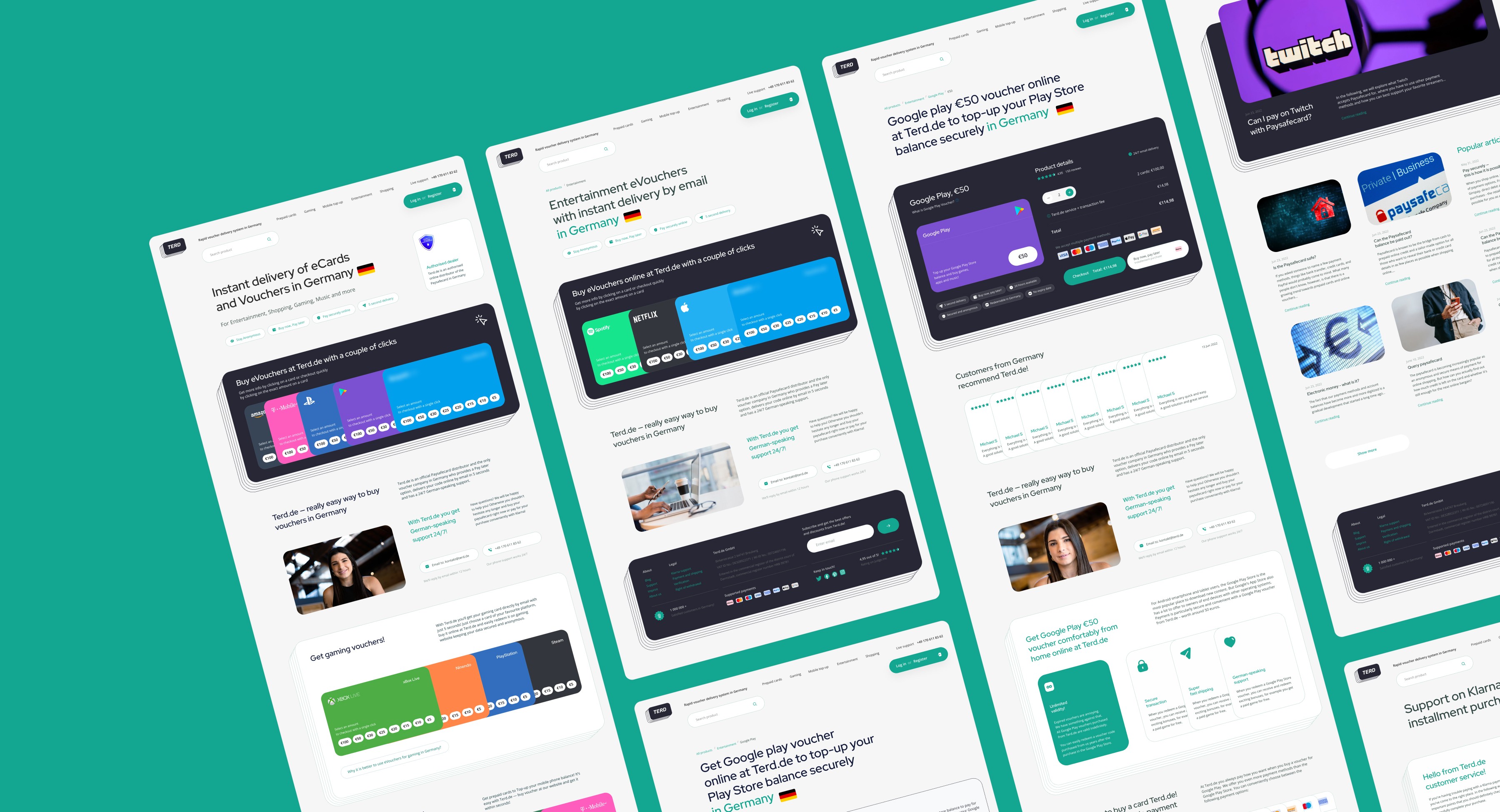
The next step involved creating a prototype with an optimized and simplified checkout flow specifically tailored for the purchase and delivery of digital goods. Initially, I focused on enhancing the checkout screens and improving the overall user experience (UX). Subsequently, I proceeded to prototype the entire website flow, considering various entry points. This included developing optimized UX flow maps and designing all relevant pages, such as the main page, categories page, and product page. A notable advantage was that the outcome went beyond a mere wireframe; it resulted in a fully designed solution ready for implementation, complete with a design system. I adopted a mobile-first approach, given that 80% of purchases originated from mobile devices. Following this, I extended the design to ensure responsiveness across other breakpoints.

Branding and new visual style
The website required a comprehensive rebranding due to its outdated nature. To meet the needs of customers, I identified key product values: fast voucher delivery, reliable service with on-time delivery, robust personal data security, and responsive support in German. With these values in mind, I proceeded to define the art direction by gathering relevant visual references. Below is a preview of the comprehensive moodboard that showcases my meticulous approach.

Concepts
Based on the established art direction, I generated over 20 different visual concepts and carefully selected the six most compelling options to present to the client.

The client expressed interest in two of the concepts and requested that I develop homepages based on each of them. We engaged in a thorough discussion to determine which concept to select, as both options effectively conveyed the brand message and presented relevant solutions. It was a challenging decision to make, given the strong suitability of both concepts.

Final design
In the end, the client opted for the more serious-looking concept, and I proceeded to design all the website pages in line with the chosen visual style.

Design System
To facilitate the handoff of the project to the development team, I meticulously organized all the created components and their respective states into a comprehensive design system.

Credentials
UI/UX design, Art direction: Dmitry Chernov