Corporate website for a Cyber Security company
Corporate website
/
Cyber Security
/
Canada
Security Authorities is an IT security and maintenance company based in Canada. The task was to design a corporate website from scratch to showcase the services offered by the company.
Project scope
Briefing
Art direction
Concepts
Visual design
Development handoff
Design process
The client requested the design of a corporate website from scratch. We underwent a comprehensive design process, which involved conducting client interviews, establishing an art direction, creating design concepts, and developing responsive design mockups to showcase the company's services and benefits.

Client interview and prototyping
The client had already provided a rough prototype with some text. However, I decided to schedule an interview and brief the client to gather more information about the business, key services, and its value. This allowed me to gather essential communication insights and effectively explain the services and their value. During this stage, I created a more detailed text prototype, incorporating copywriting.
Art direction
In order to establish relevant communication, I gathered the key brand associations: Hi-tech, Security, Reliability, Resilience, and Metiliciousness. Based on these associations, I collected references for colors, composition, typography, and graphics that visually convey these meanings.

Concepts
Great! Now it's time to discuss concepts. Building upon the moodboard, I began generating various visual concepts in order to identify the most impactful ideas that effectively convey the intended meanings. To expedite the process, I focused on the first two screens of the homepage. Ultimately, I have produced 9 viable concepts that we can review and select from in consultation with the client.
As part of my usual approach, I create numerous concepts to explore different compositions, colors, and typography in line with the art direction. Here is a snapshot of the final stage in my 4-step concept creation process, which typically takes me approximately 2-3 days.

Here are the final concepts that I discussed with the client.

Concept 1: The client appreciated the metaphor with the windows buttons, but both of us agreed that the concept had a somewhat "hacker" aesthetic due to the acid green color. We reached a consensus that it should have a more professional and business-oriented appearance.
Concept 2: The client appreciated the light-weight composition and the soft wavy shape, but we felt that we needed something that conveyed a sense of reliability and organization.

Concept 3: This concept appears more reliable with its blue colors and techy font. However, we felt that it needs some less of the softness to emphasize reliability more prominently.

Concept 4: The client expressed their appreciation for this idea and considered it as one of the strongest concepts. However, we felt that it lacked a certain accent, prompting me to suggest considering another concept.
Concept 5: This concept appears significantly stronger, but it comes across as too sharp. We were aiming for a design that is slightly more friendly in nature.

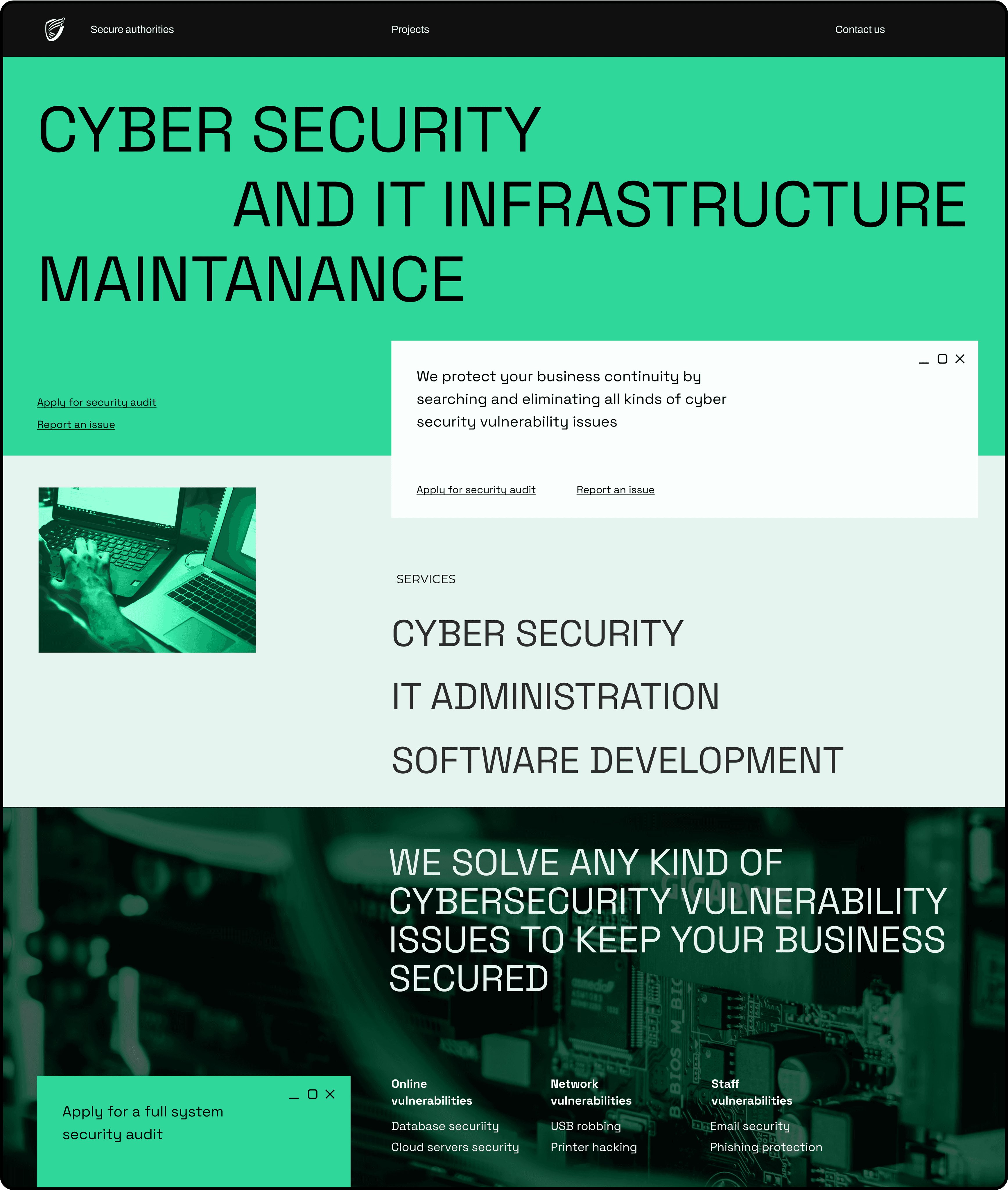
Concept 6: The color scheme is perfect, and we absolutely want to keep it as it provides the necessary level of reliability that we were seeking.

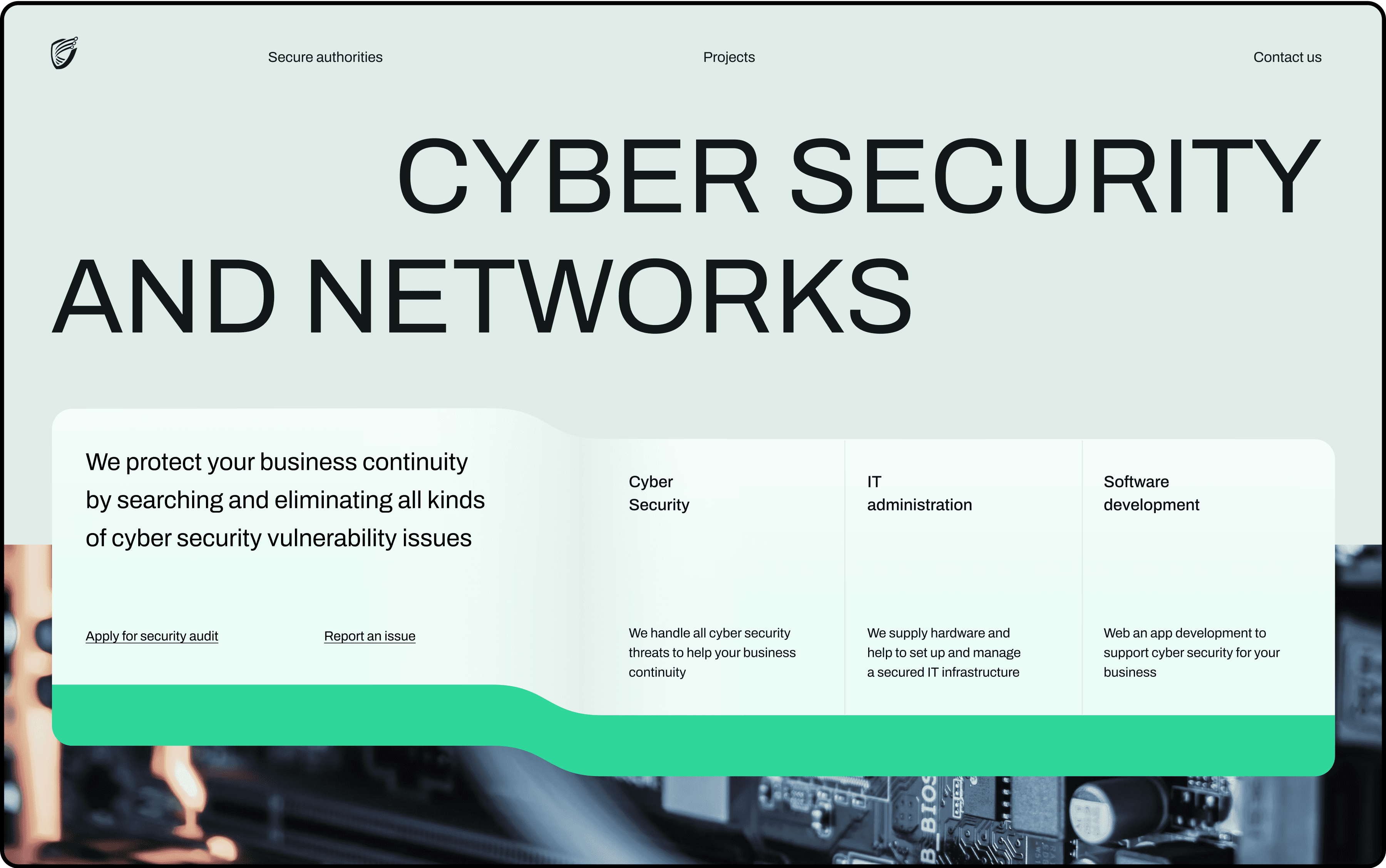
Concept 7: The client has chosen this concept, and it feels like we have discovered something truly captivating. The design exudes a techy vibe, thanks to the typography and color scheme. Additionally, the color scheme, combined with the stacked rectangular shapes in a grid, provides the desired level of reliability and security. The inclusion of a vibrant blue accent adds dynamism to the mockup. The counter space makes the layout look modern, and lastly, the thin lines in the background contribute to the desired level of meticulousness.
Concept 8: The layout has a techy appearance, and the black accent evokes associations of reliability and security. However, the concept could benefit from incorporating bright accents to enhance its dynamism.

Concept 9: The concept of organizing cards in grids provides a sense of structure and order. However, the color scheme should be more dynamic to effectively convey the high speed of responses we want to showcase.
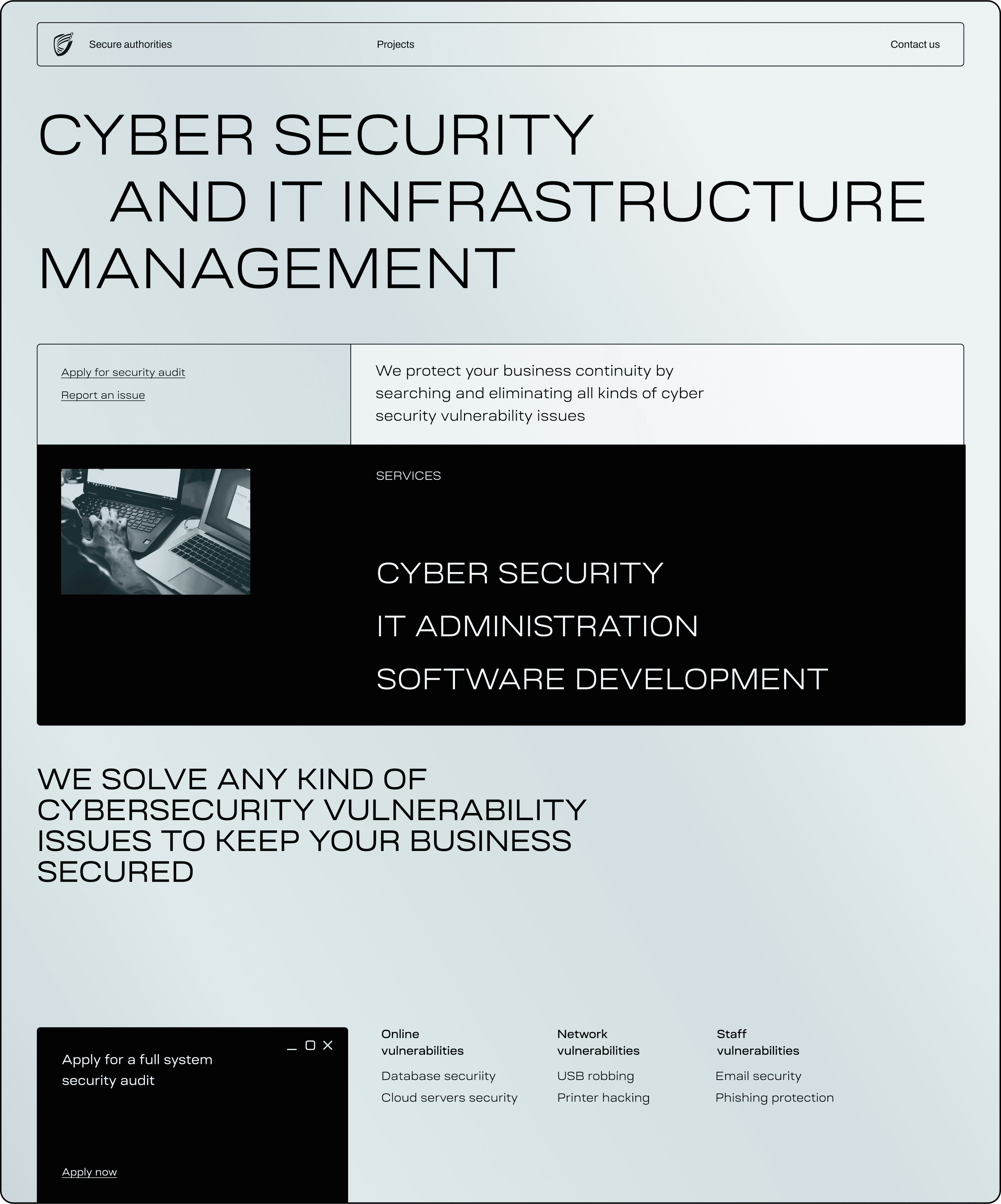
Final design
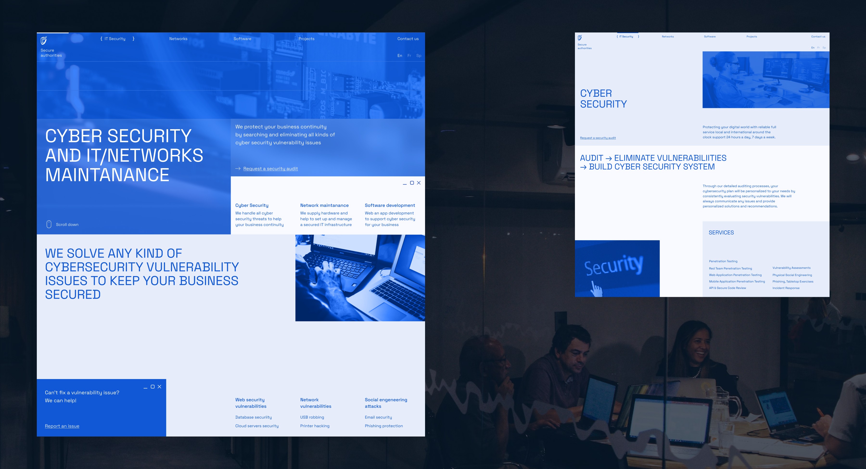
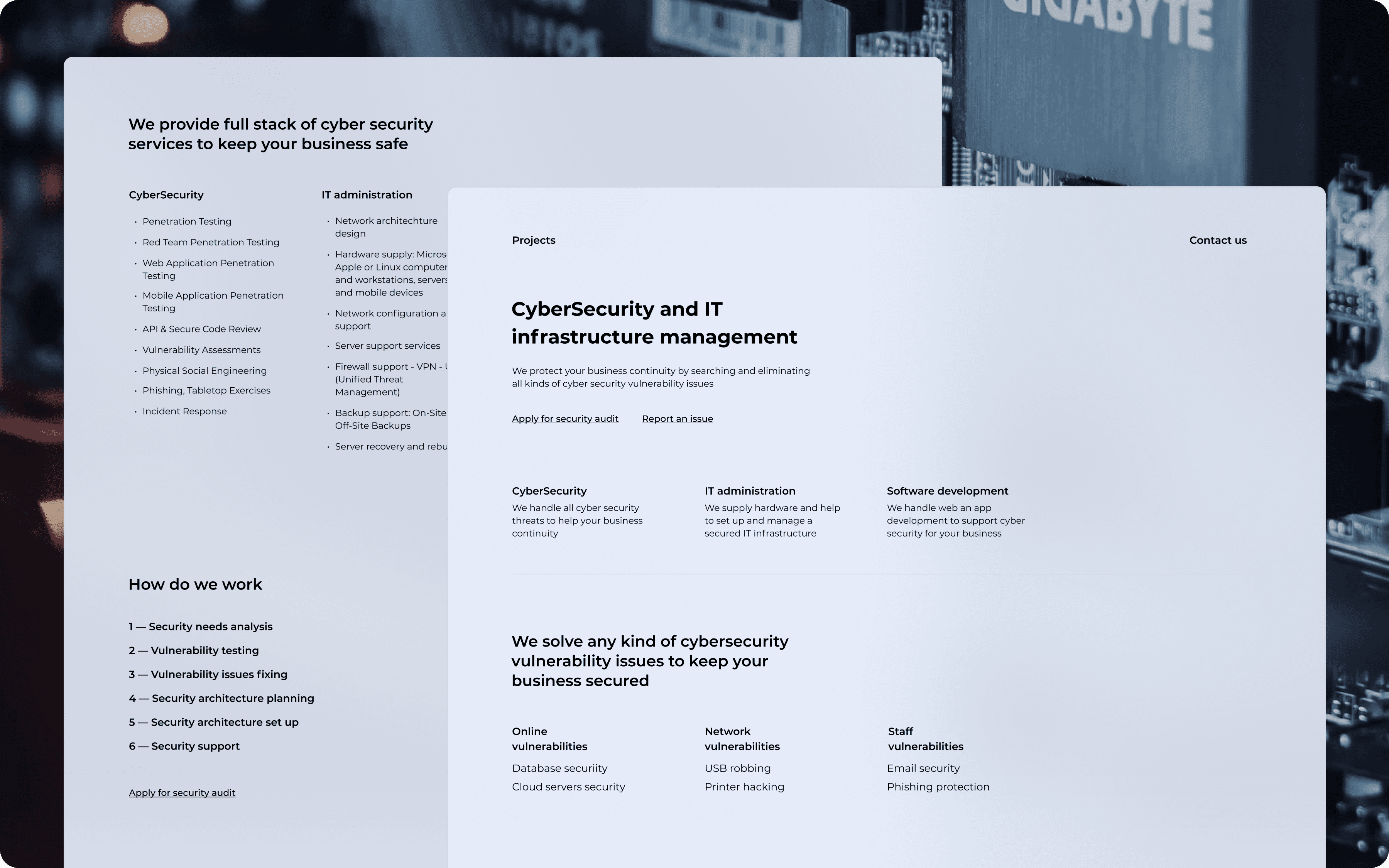
Once we selected the optimal visual concept, I began designing the final mockups. With only five pages to work on, it didn't take much time to complete the task.

However, I made the decision to allocate more time for designing responsive mockups due to the complexity of the layout. Here is the final result we achieved for the homepage.

As for interactive component states, fortunately, there weren't many components, so there was no need to develop a design system.

Overall, this project took me approximately 40 hours to complete, and I was able to deliver the final result within a span of 2 weeks while working part-time.
Credentials
Art direction, Design, Copywriting: Dmitry Chernov